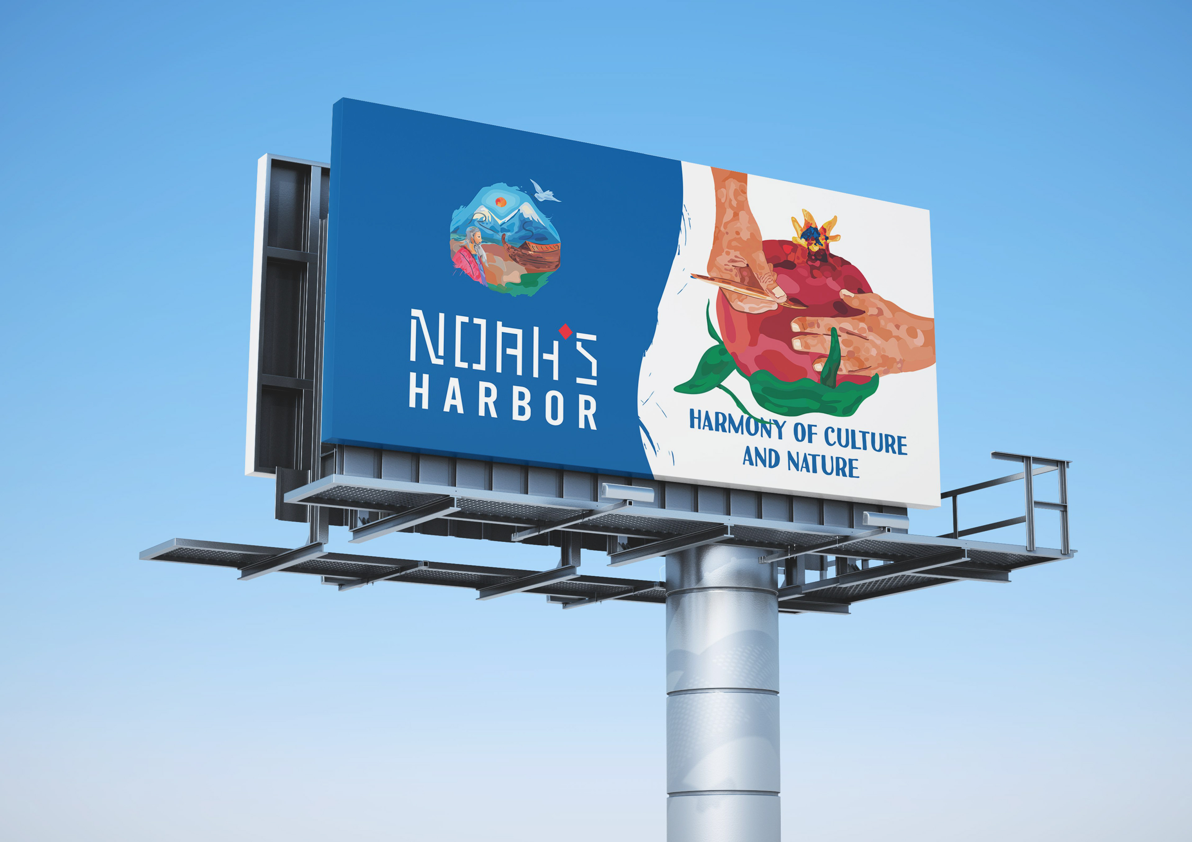

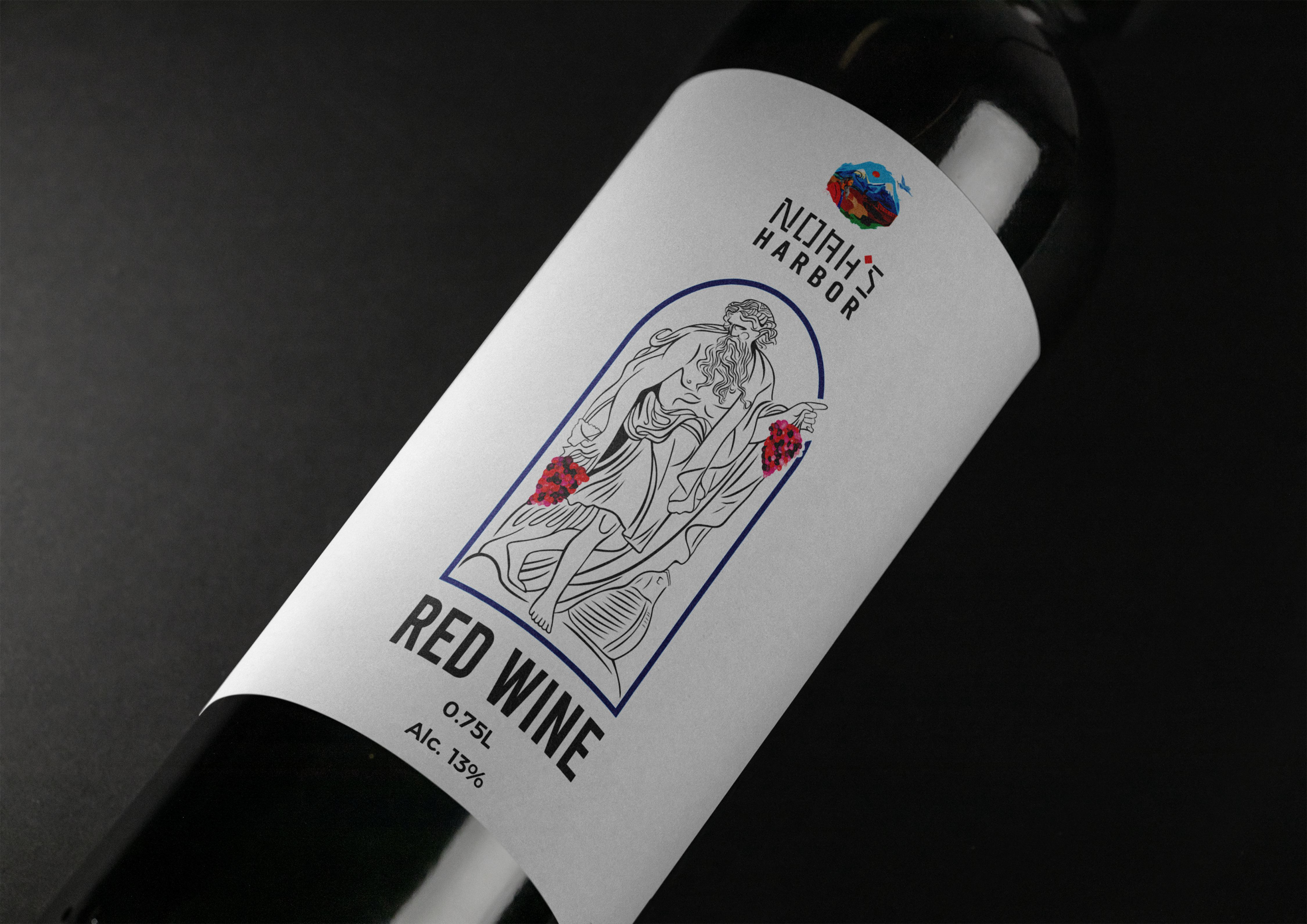
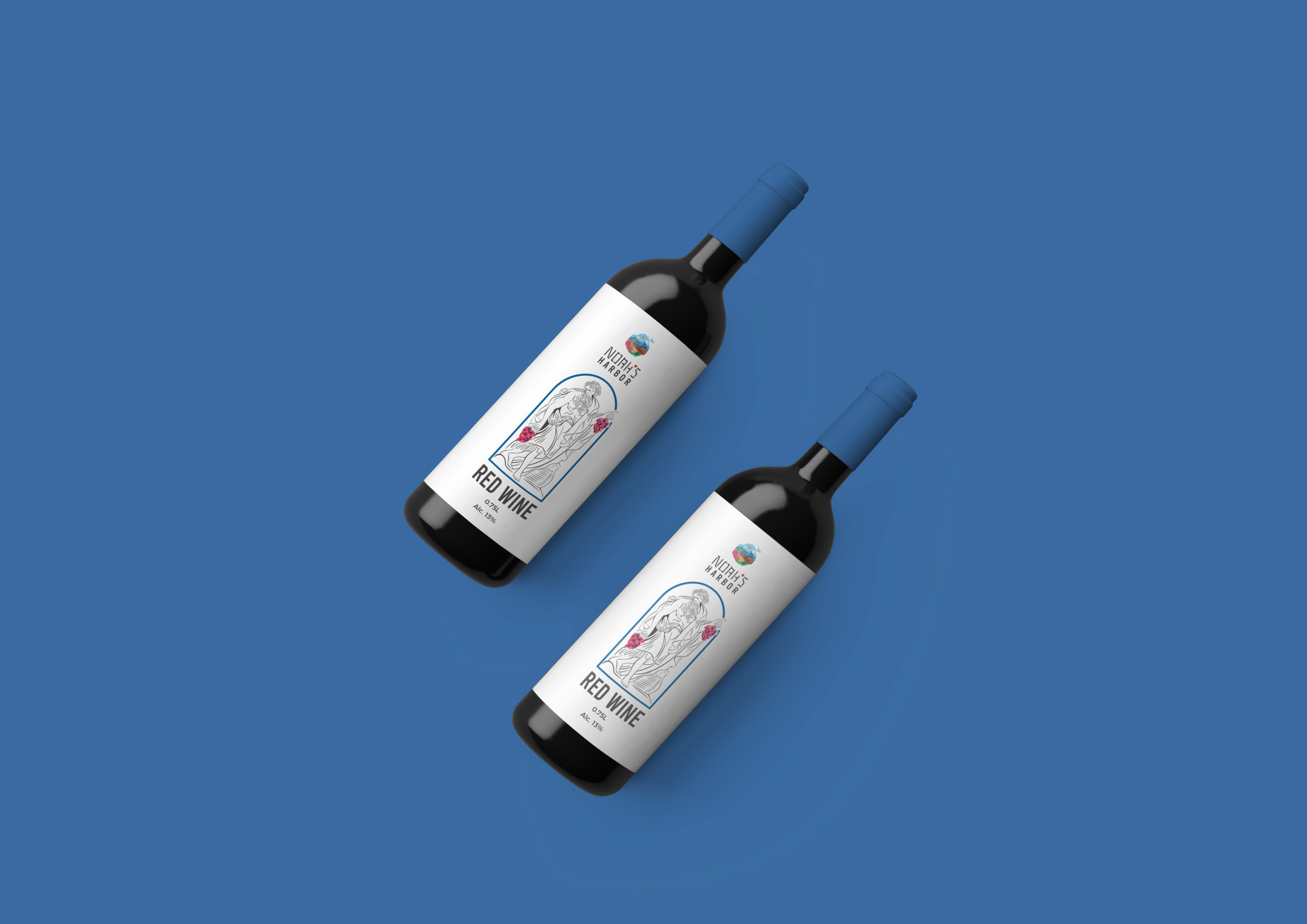
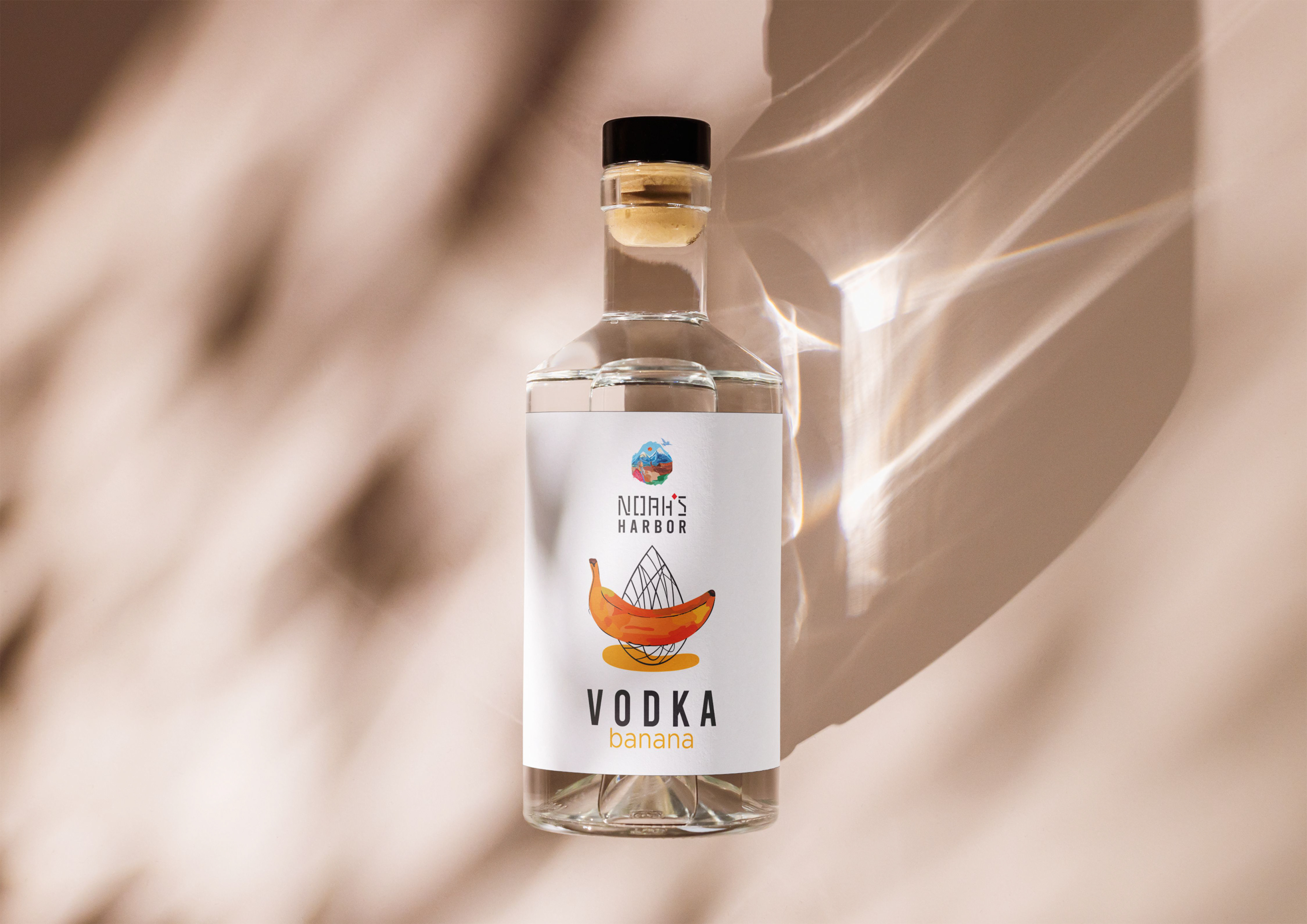
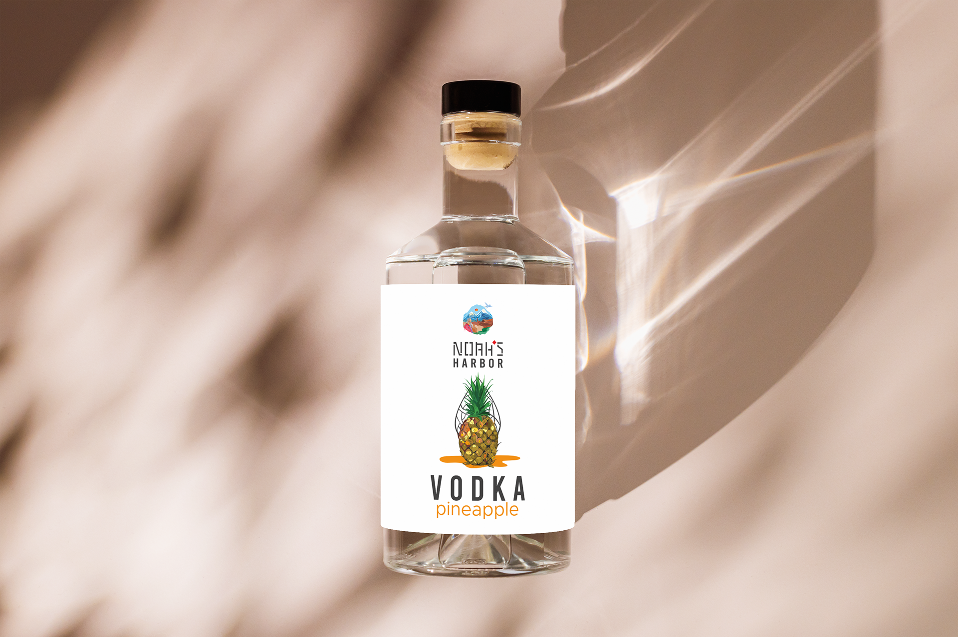
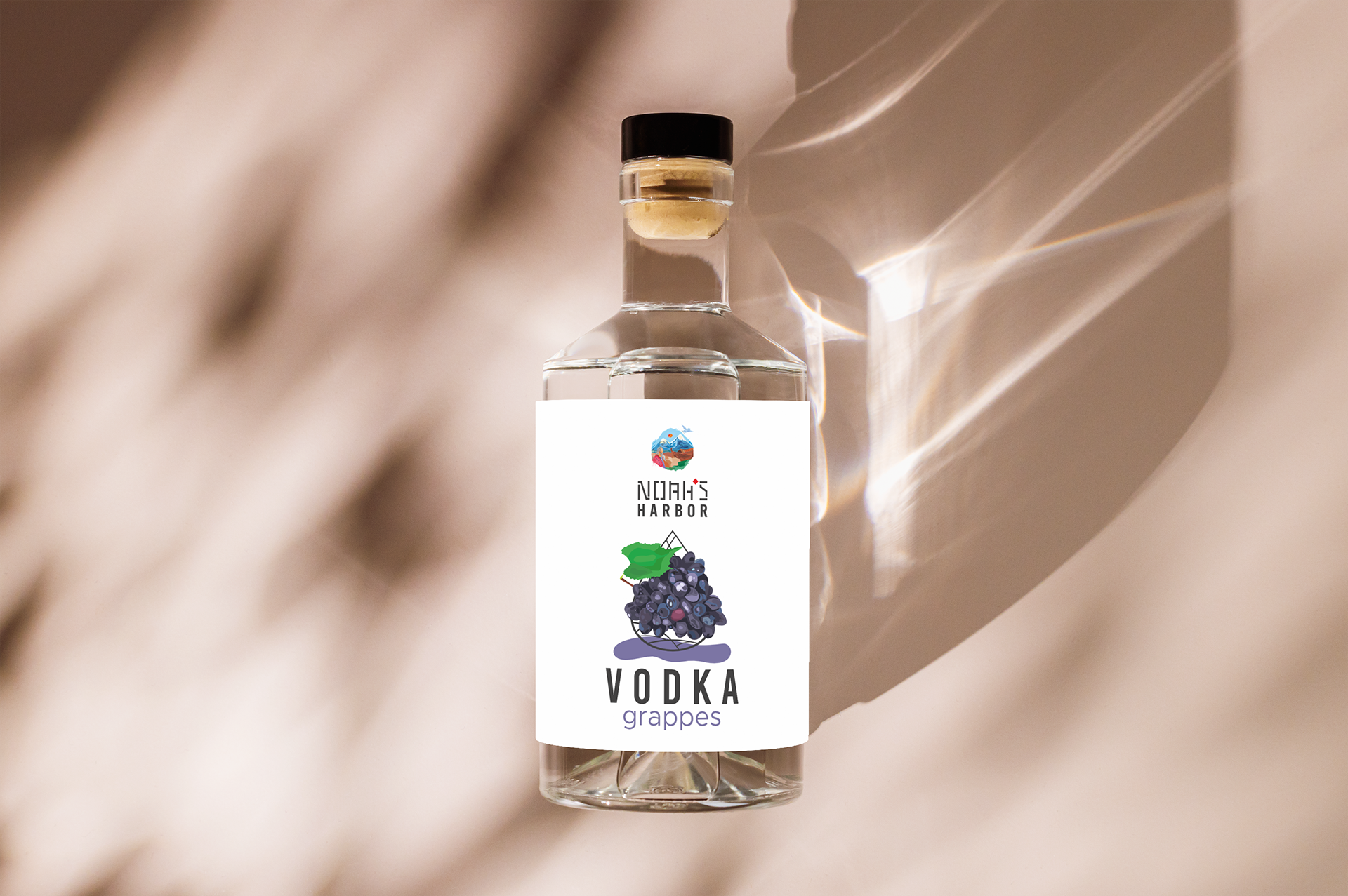


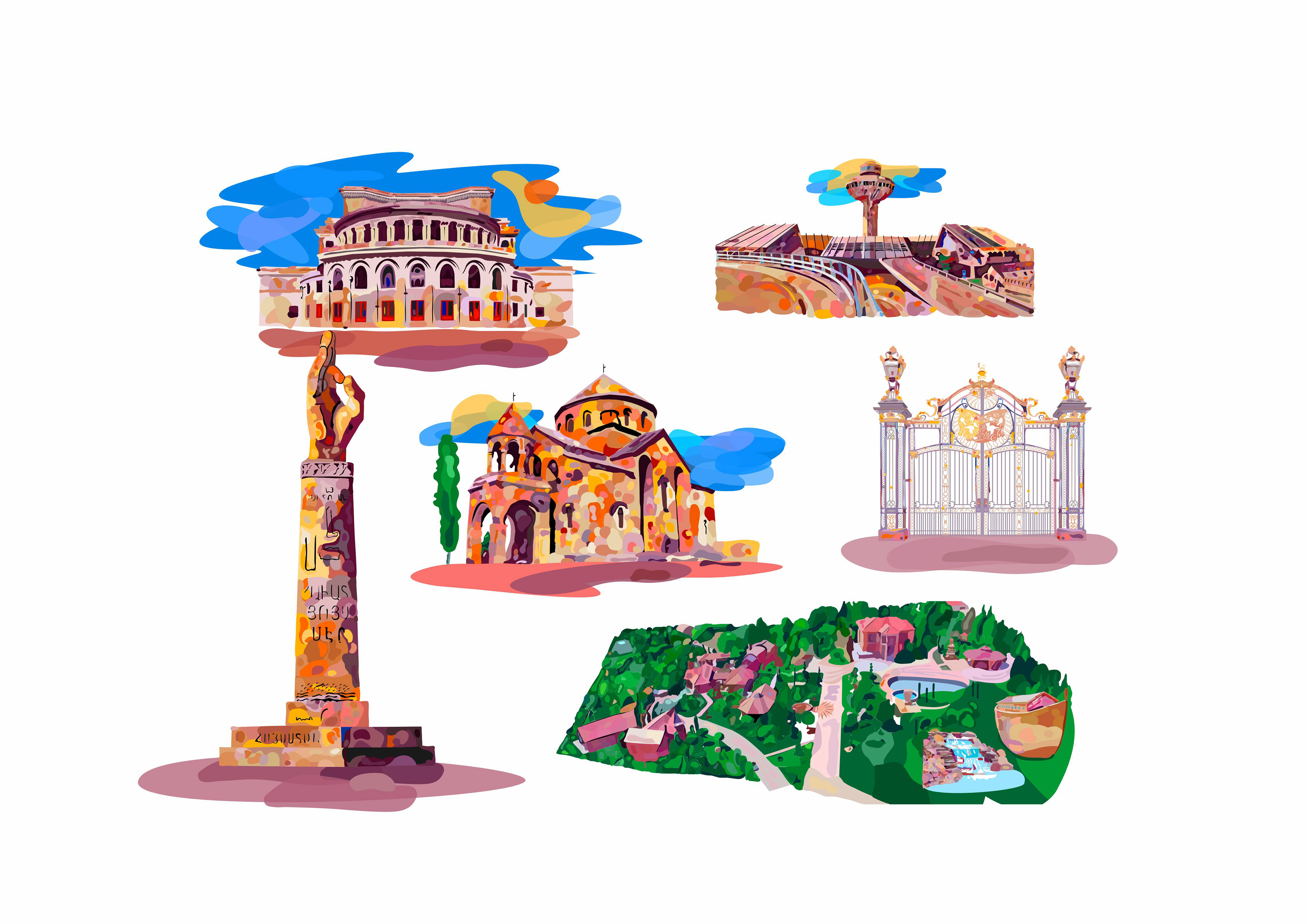
I designed a series of location illustrations for Noahs Harbor, combining functionality with the park's visual identity to make navigation simple and engaging for visitors.
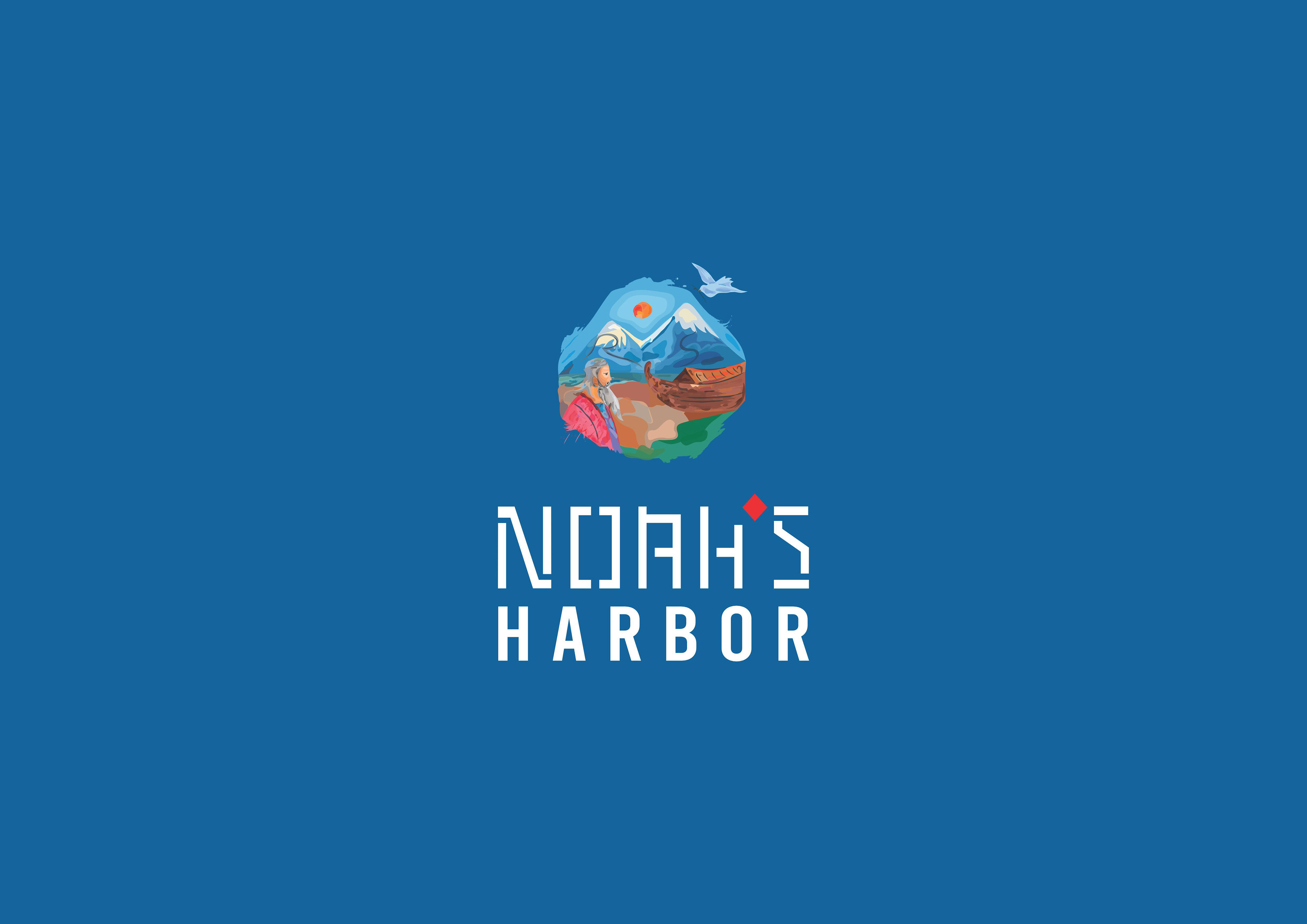
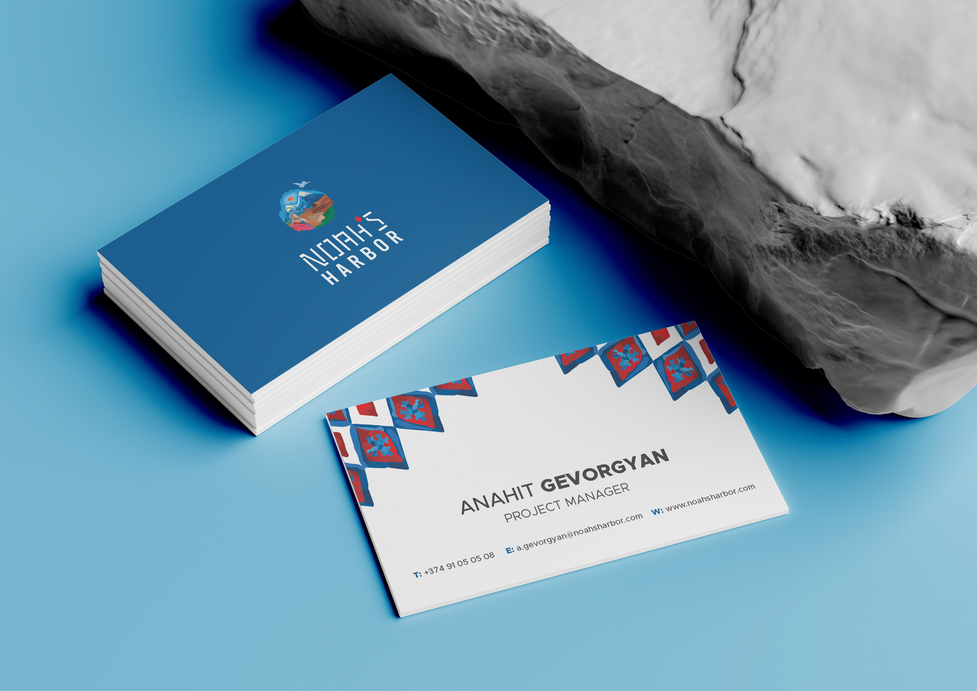
The logo has been created in an illustrative style with the goal of clearly conveying Armenian identity. Therefore, in its development, I aimed to preserve the Armenian character by using colors typical of Armenian culture. The works, colors, and style of Sarian served as my source of inspiration, and based on that, I created the logo.
While designing the logo, I deliberately moved away from current trends and stereotypes with the intention of creating my own unique style, clearly preserving the warmth characteristic of the Armenian world and the warm spirit of Sarian—as an Armenian cultural value.
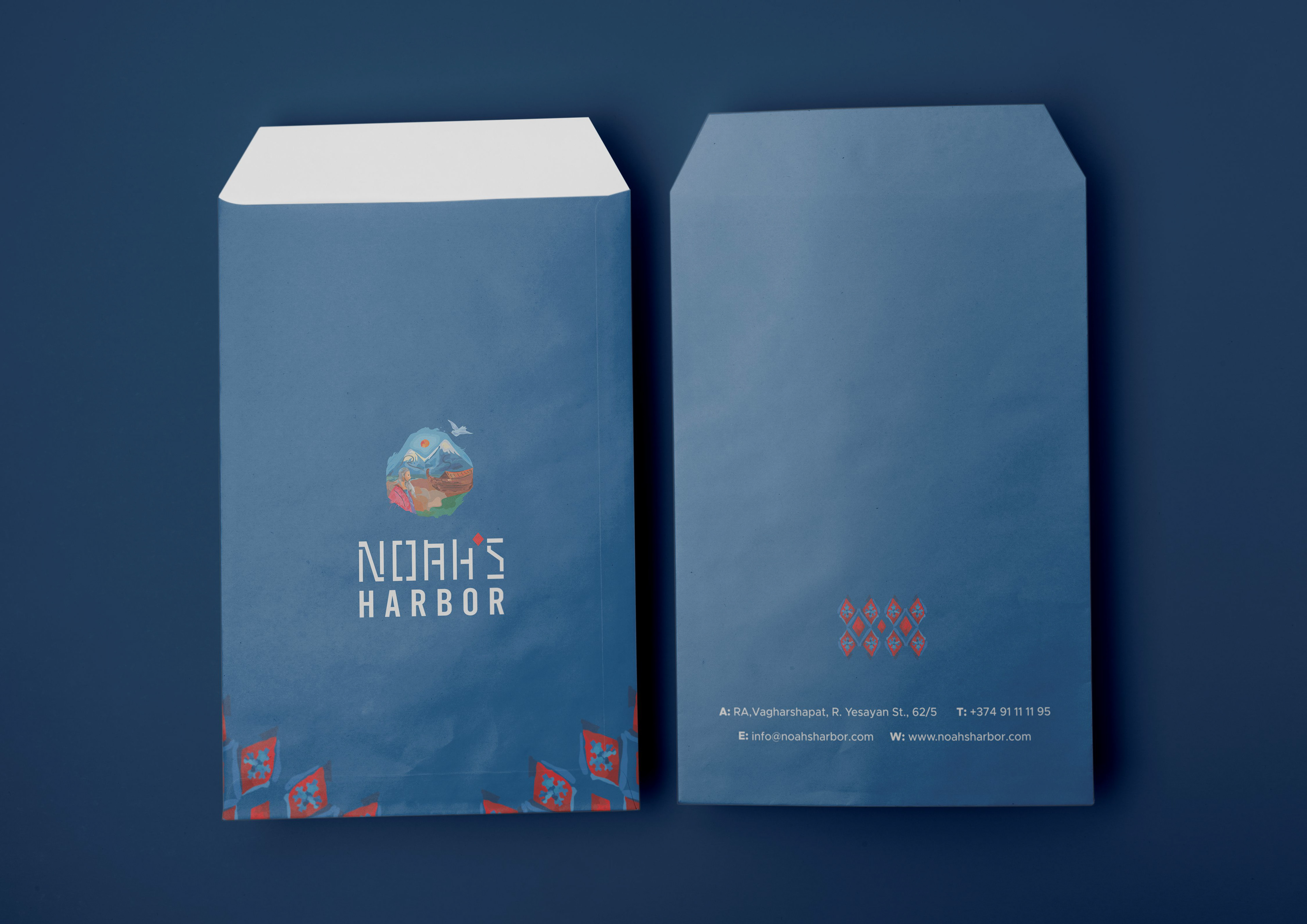
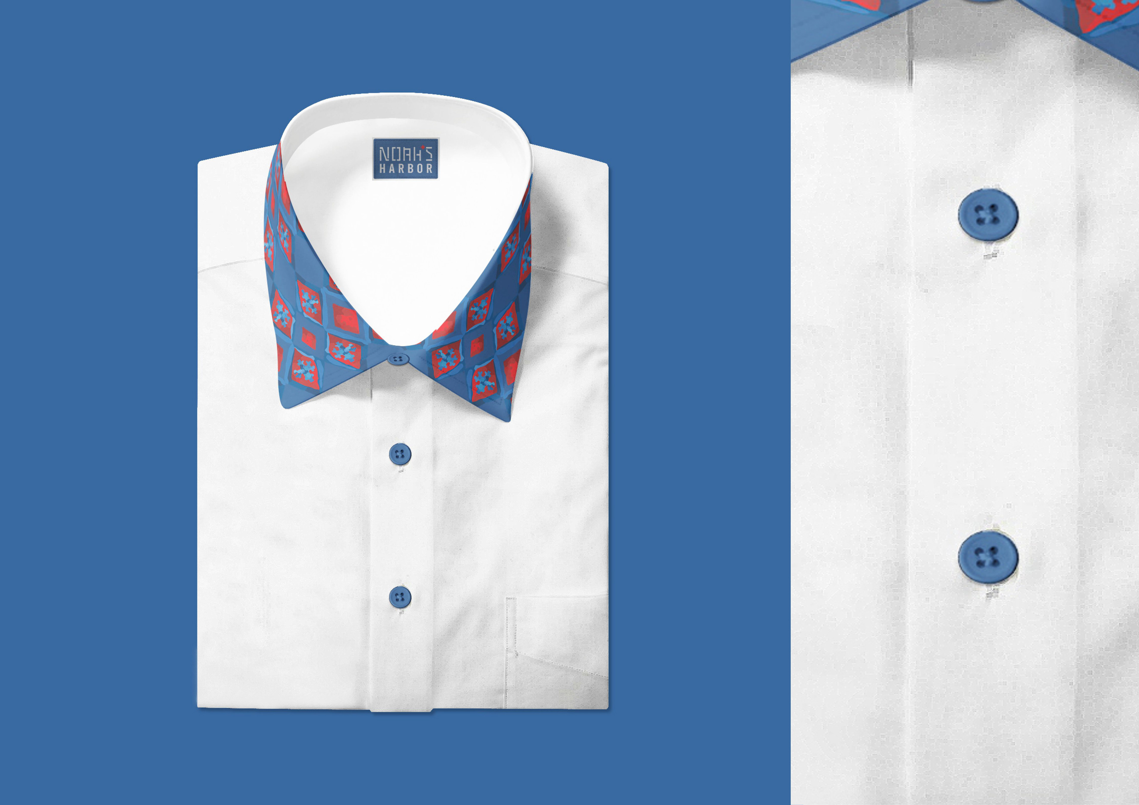
When creating the typeface (NOAHS), my goal was for it to evoke the wood fragments with which Noah built the ark, emphasizing the theme that even when using only the textual part, the font itself reveals that it refers to Noah’s harbor. In designing the typeface, I also preserved Armenian identity by incorporating Armenian ornamental patterns, which are themselves a significant cultural value.
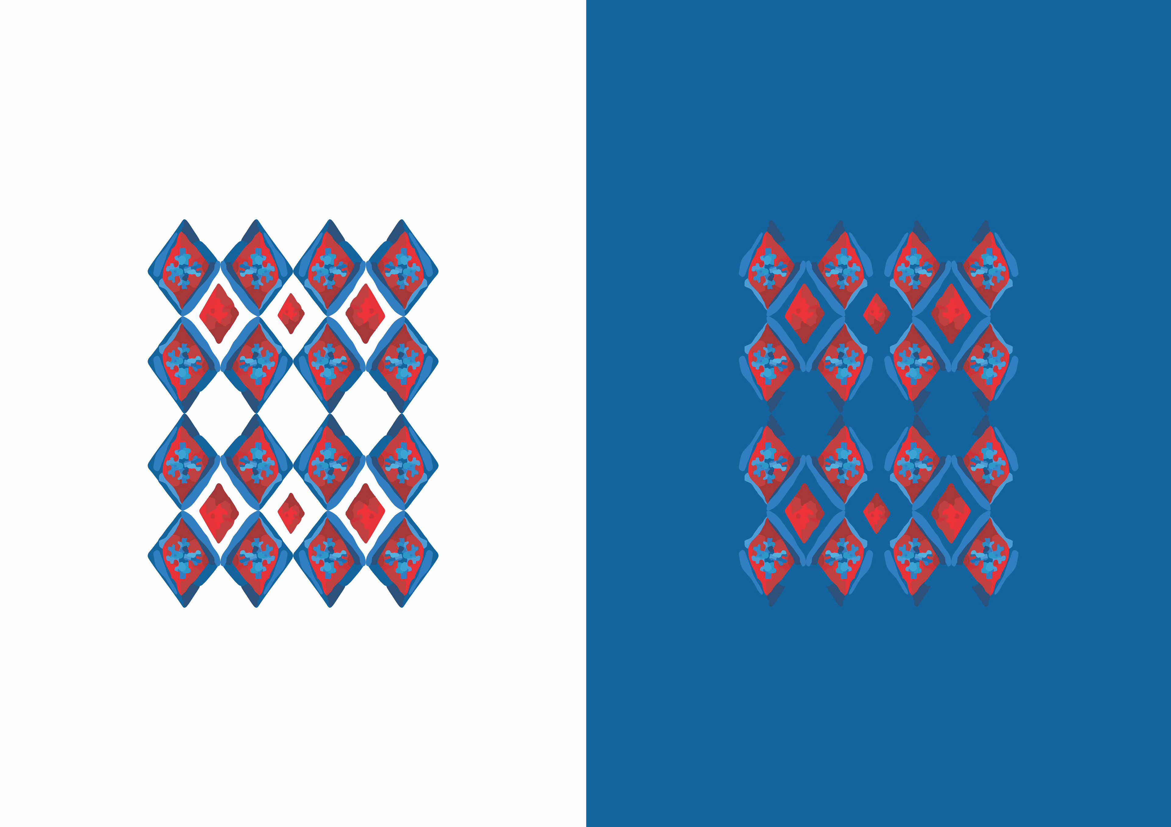
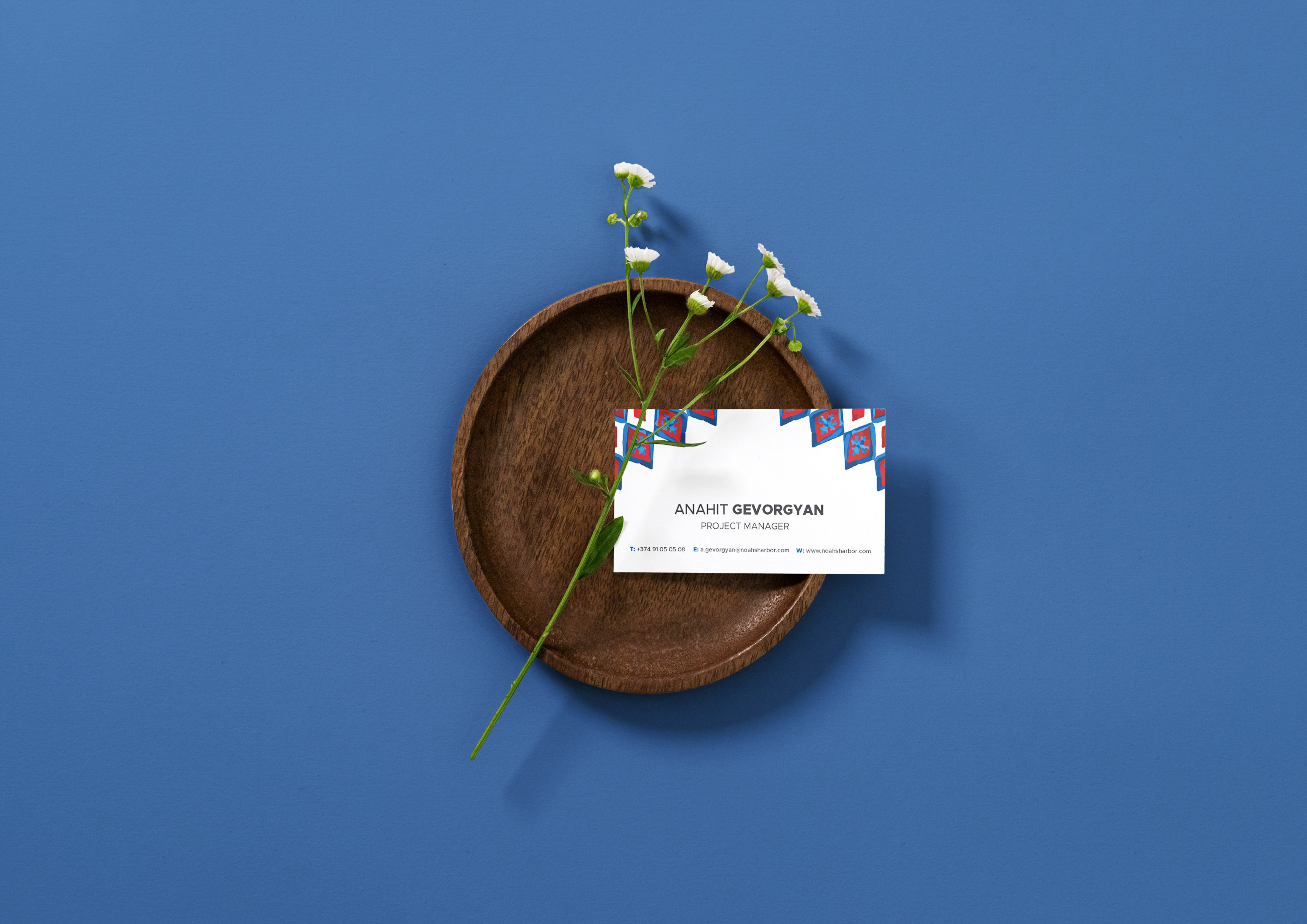
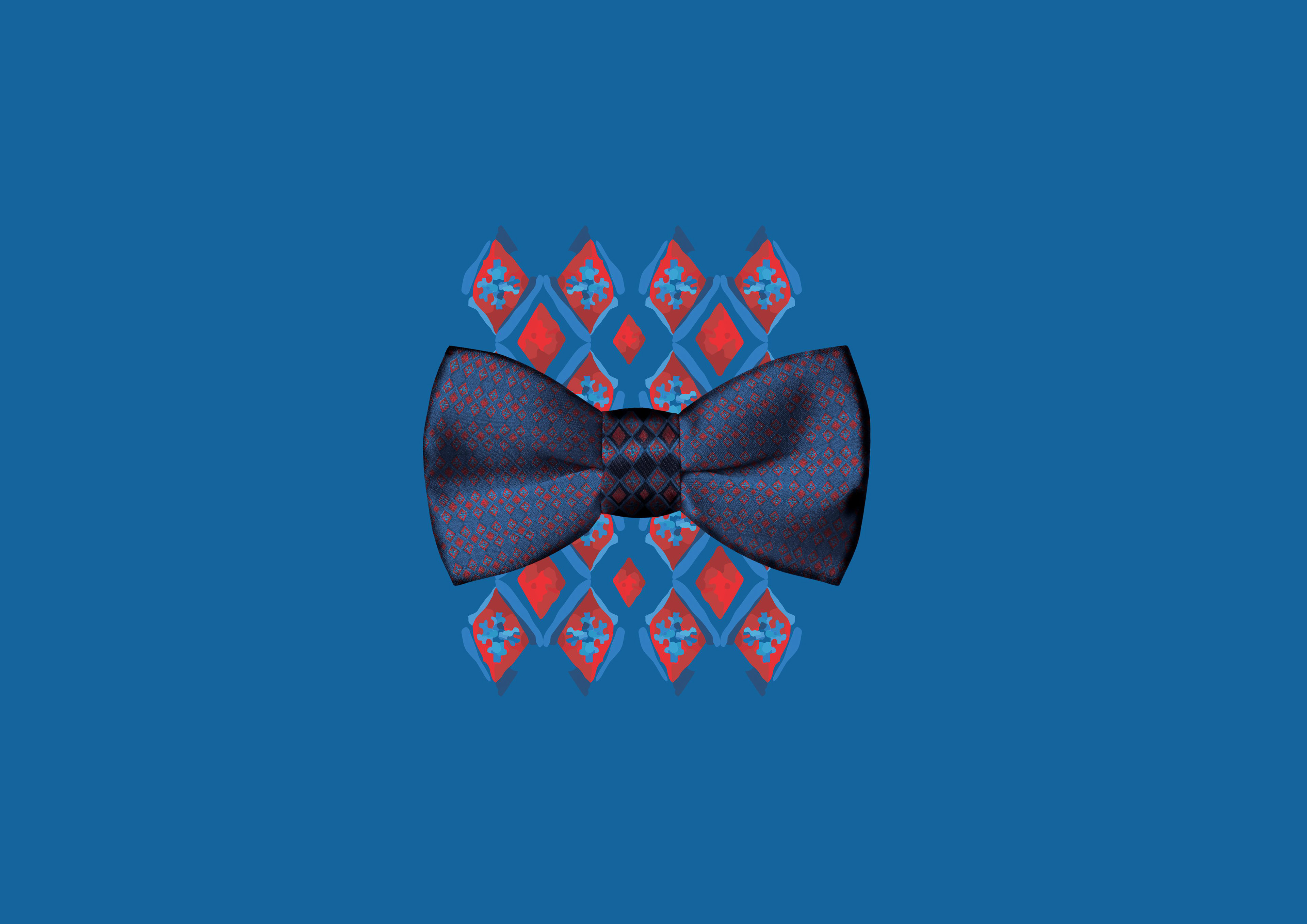
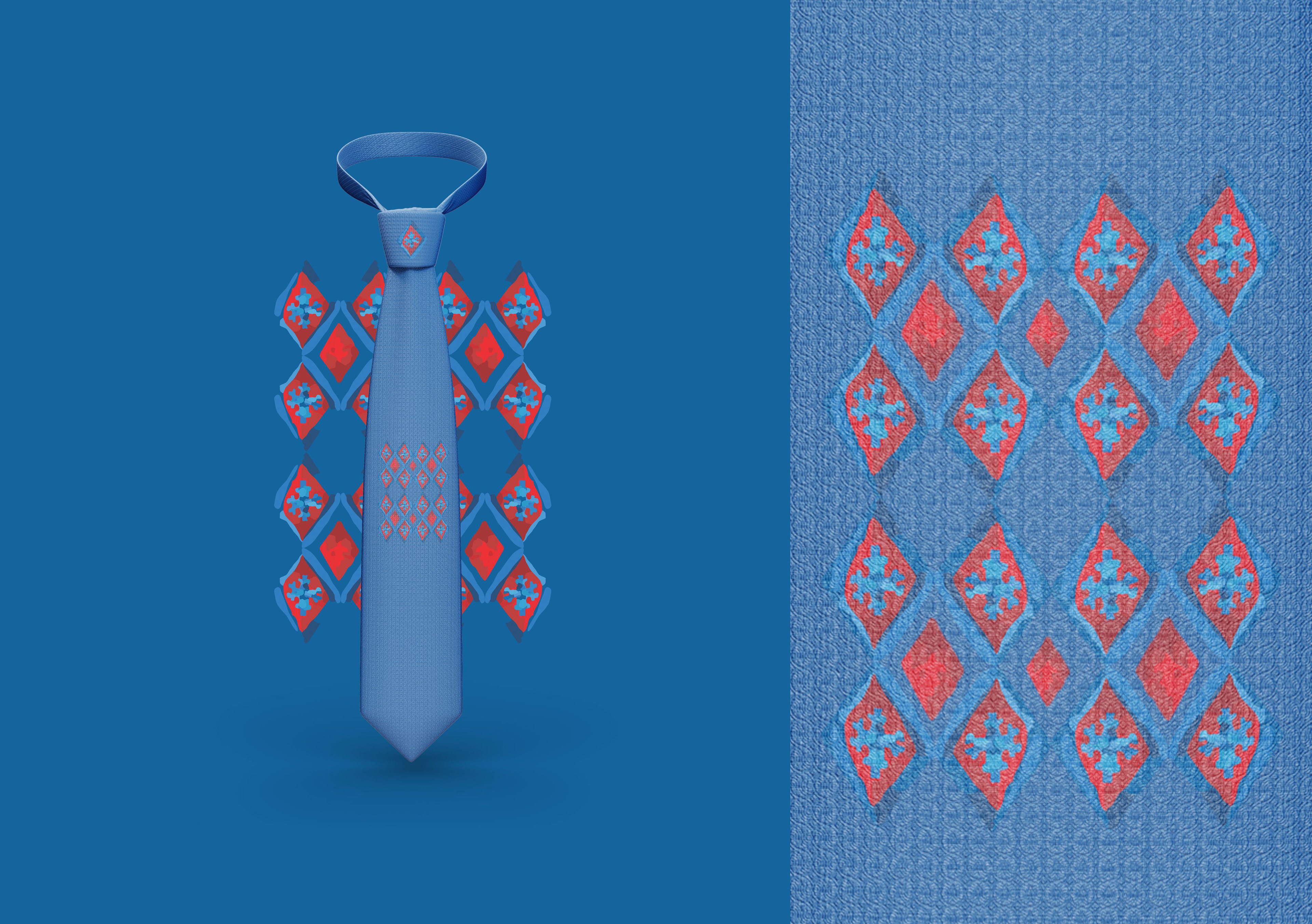
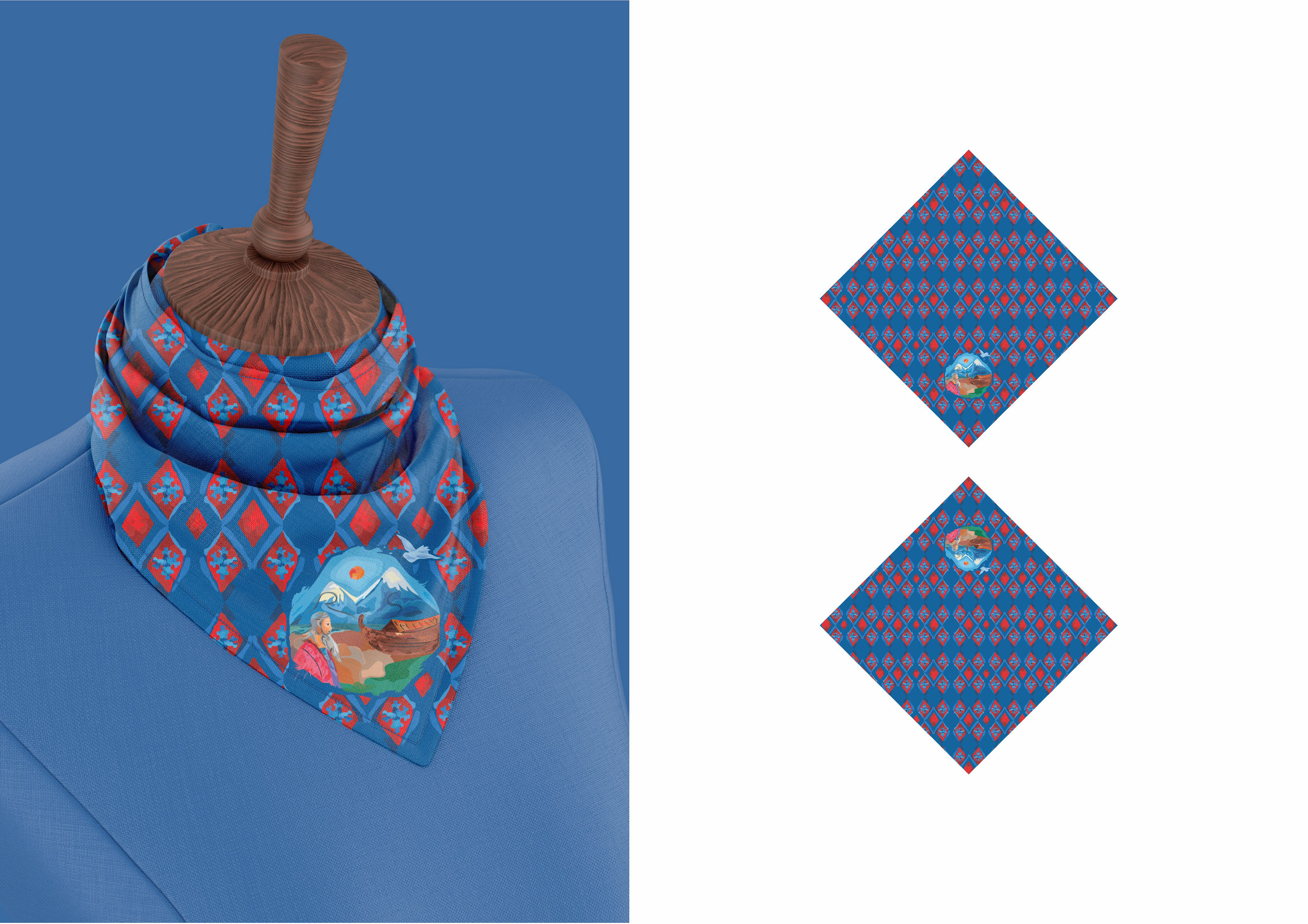
While designing the ornament, my personal source of inspiration was traditional Armenian patterns. Through this approach, I have preserved the overall style, as well as the cultural values at the core of the brand.
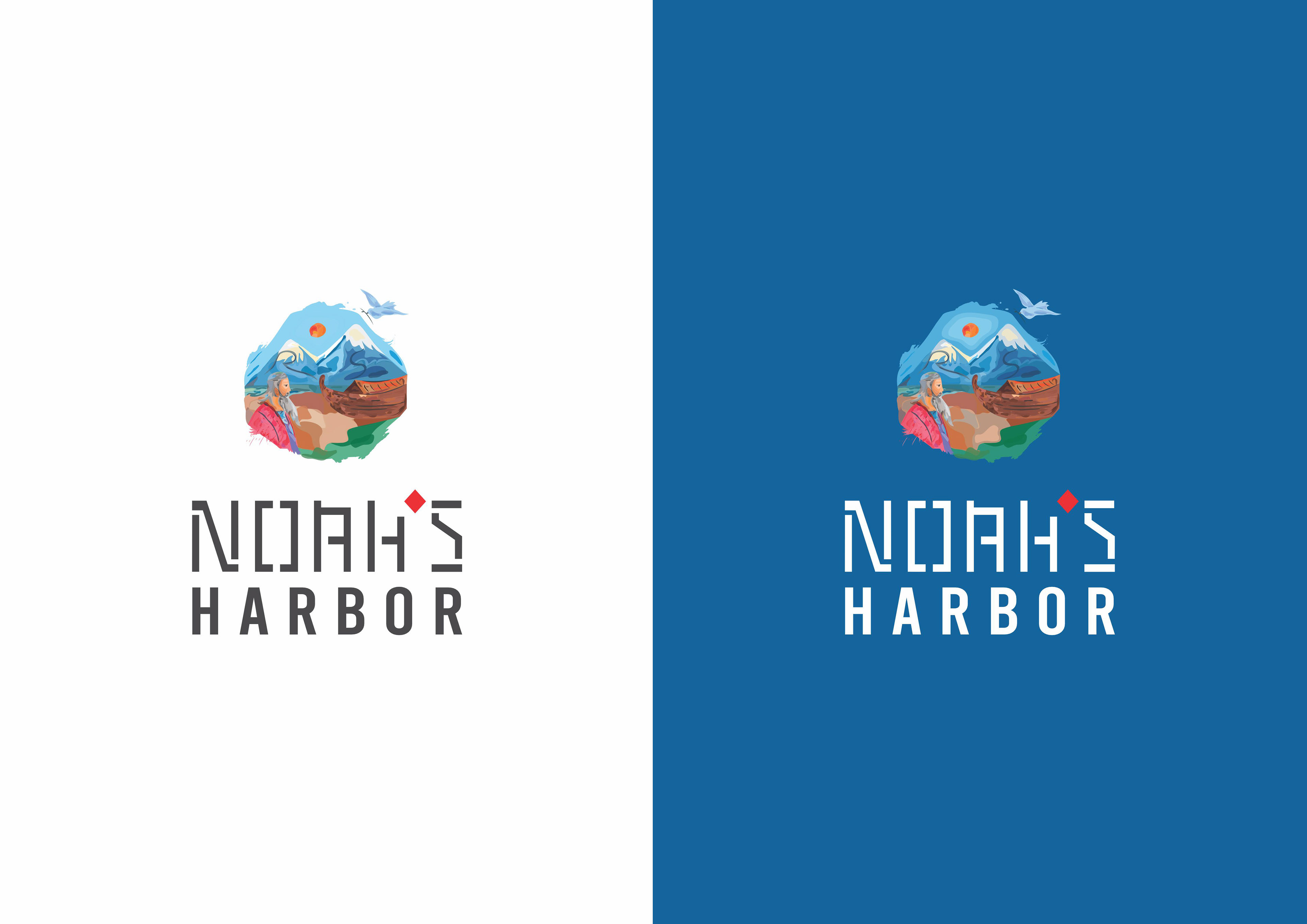
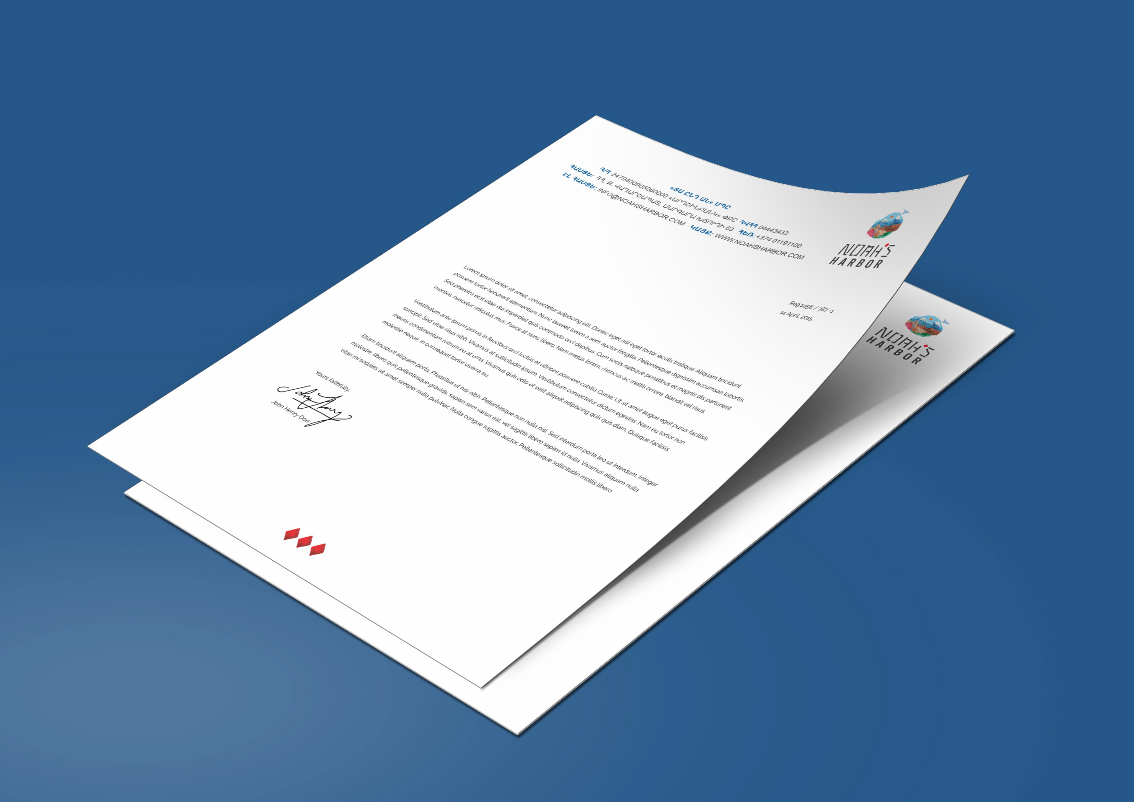
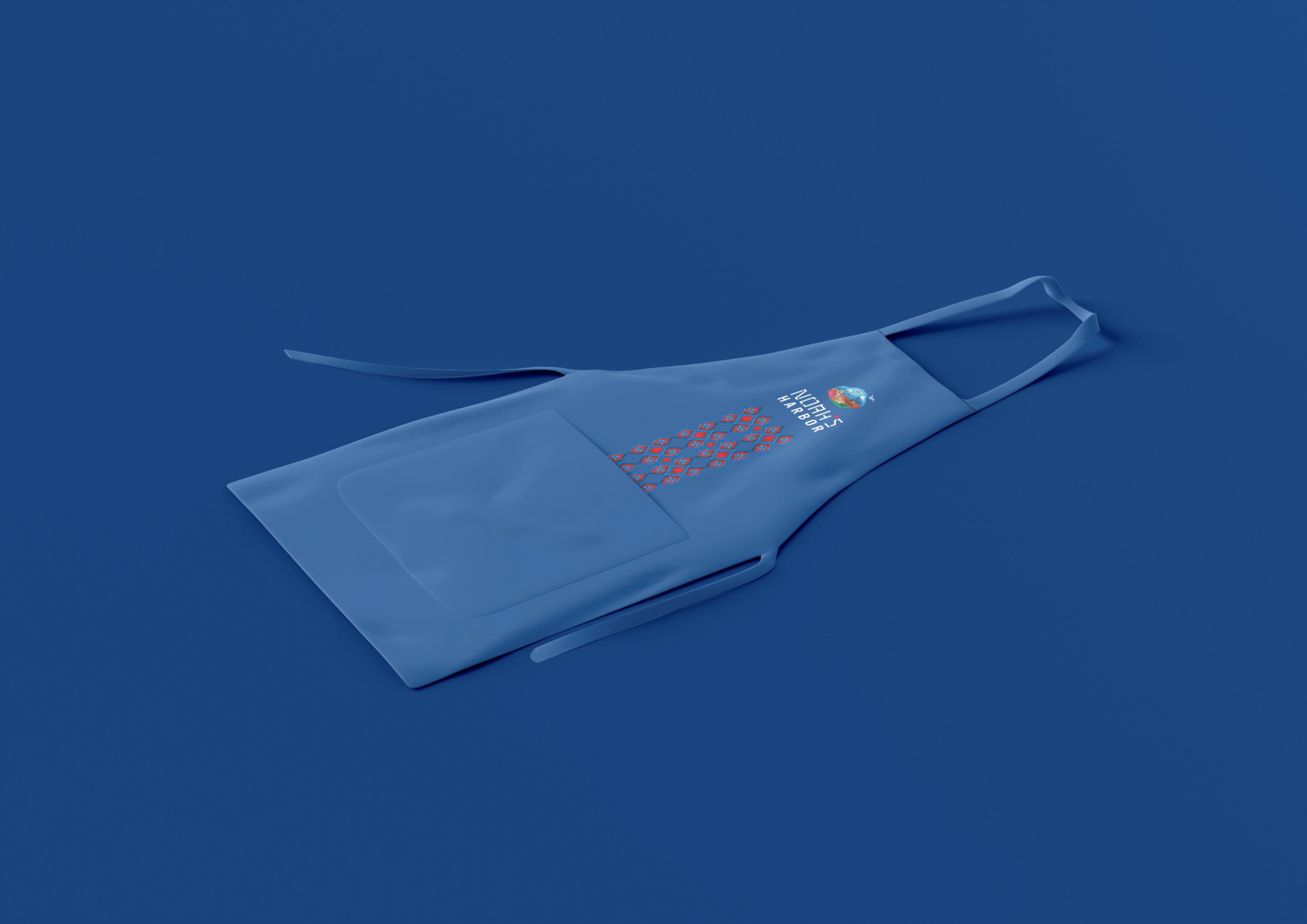
In this way, I make the brand recognizable not only through the logo but also through the ornaments, which will be used in the design of various printed materials, during events, and so on.
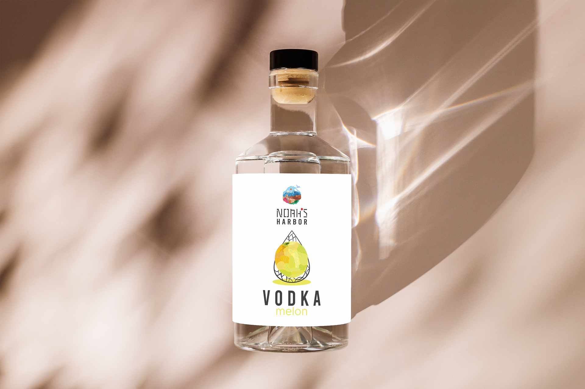
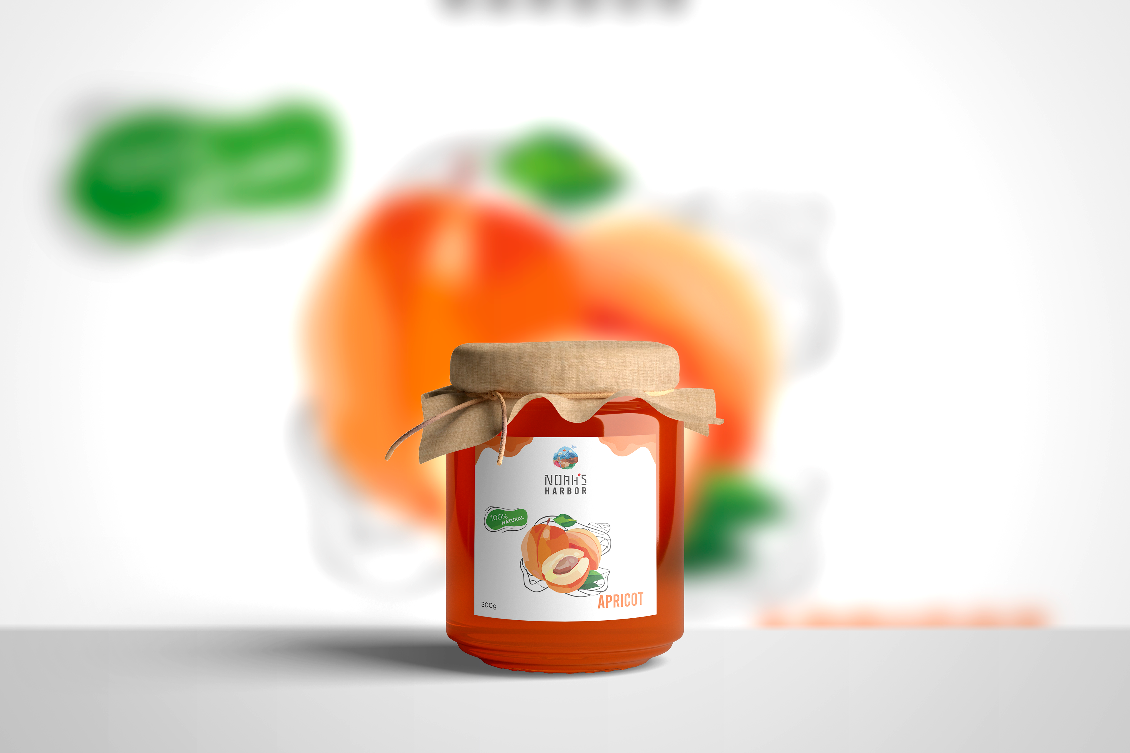
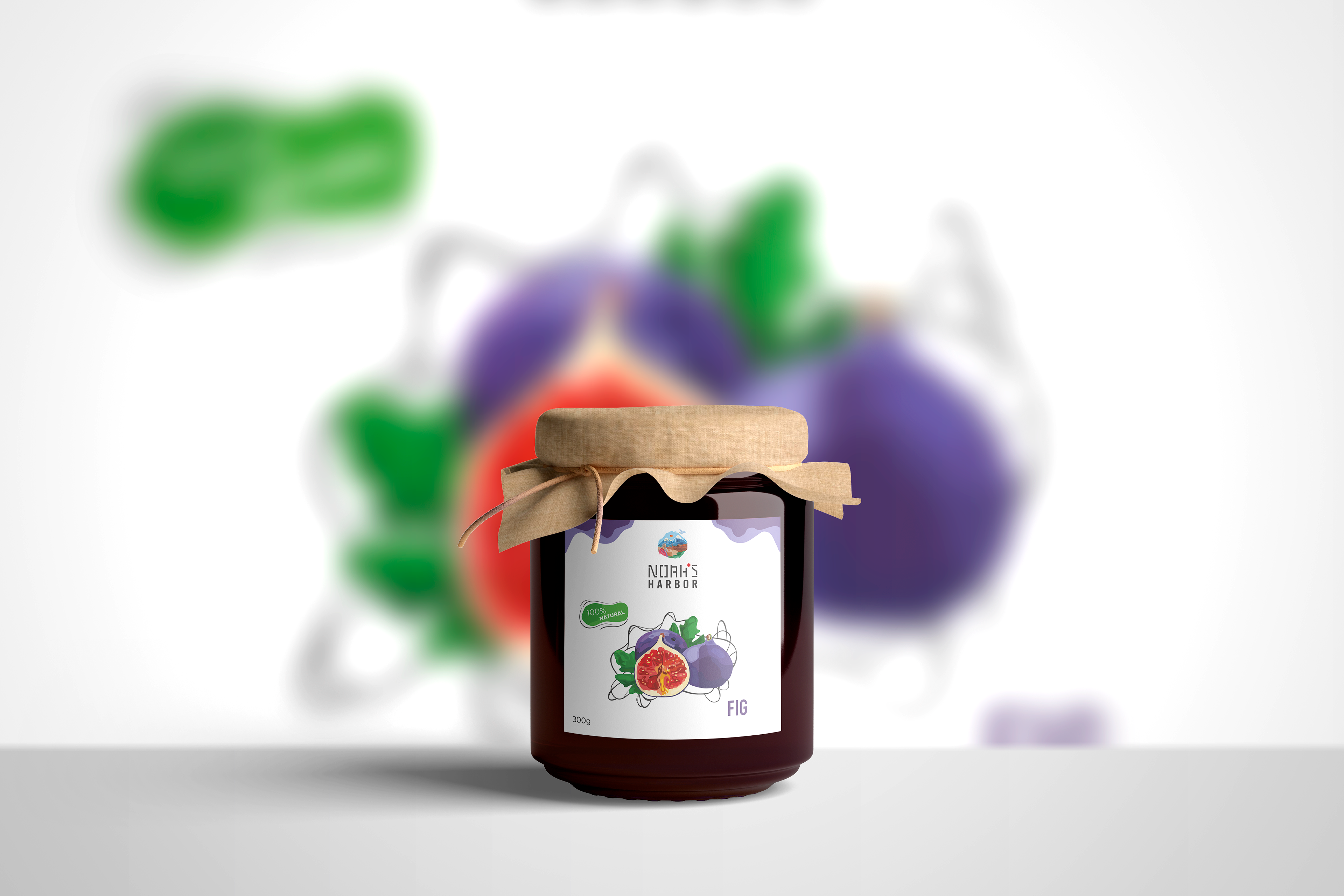
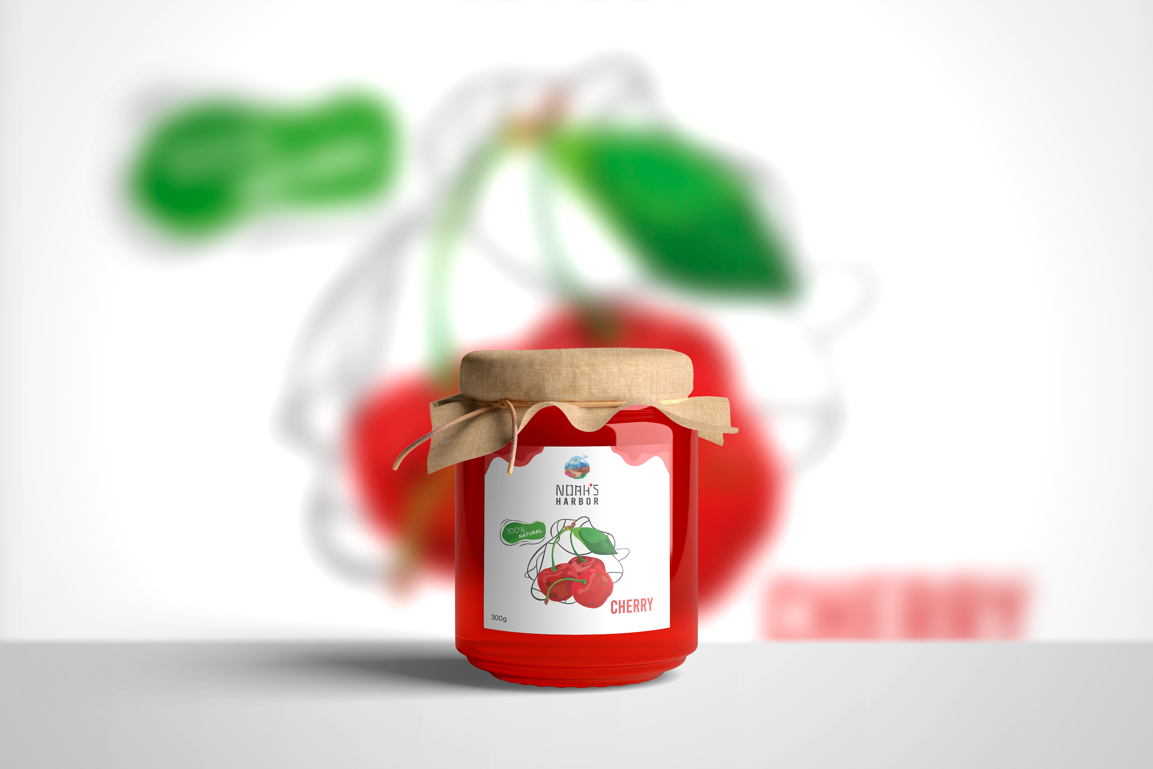
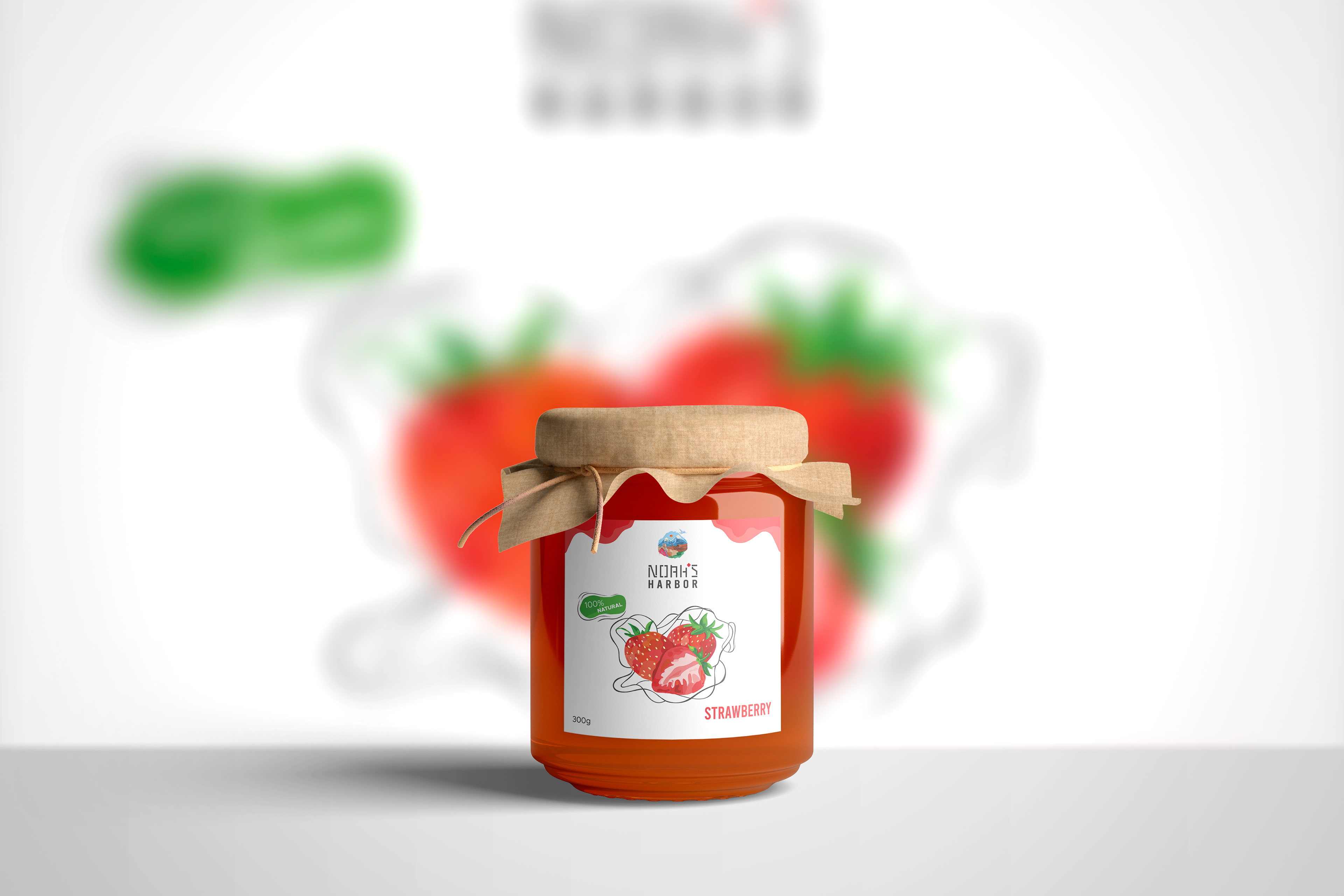
For this cultural park, I have developed all additional product illustrations in an artistic, illustrative style, ensuring consistency with the park's visual identity and preserving its unique brand character.