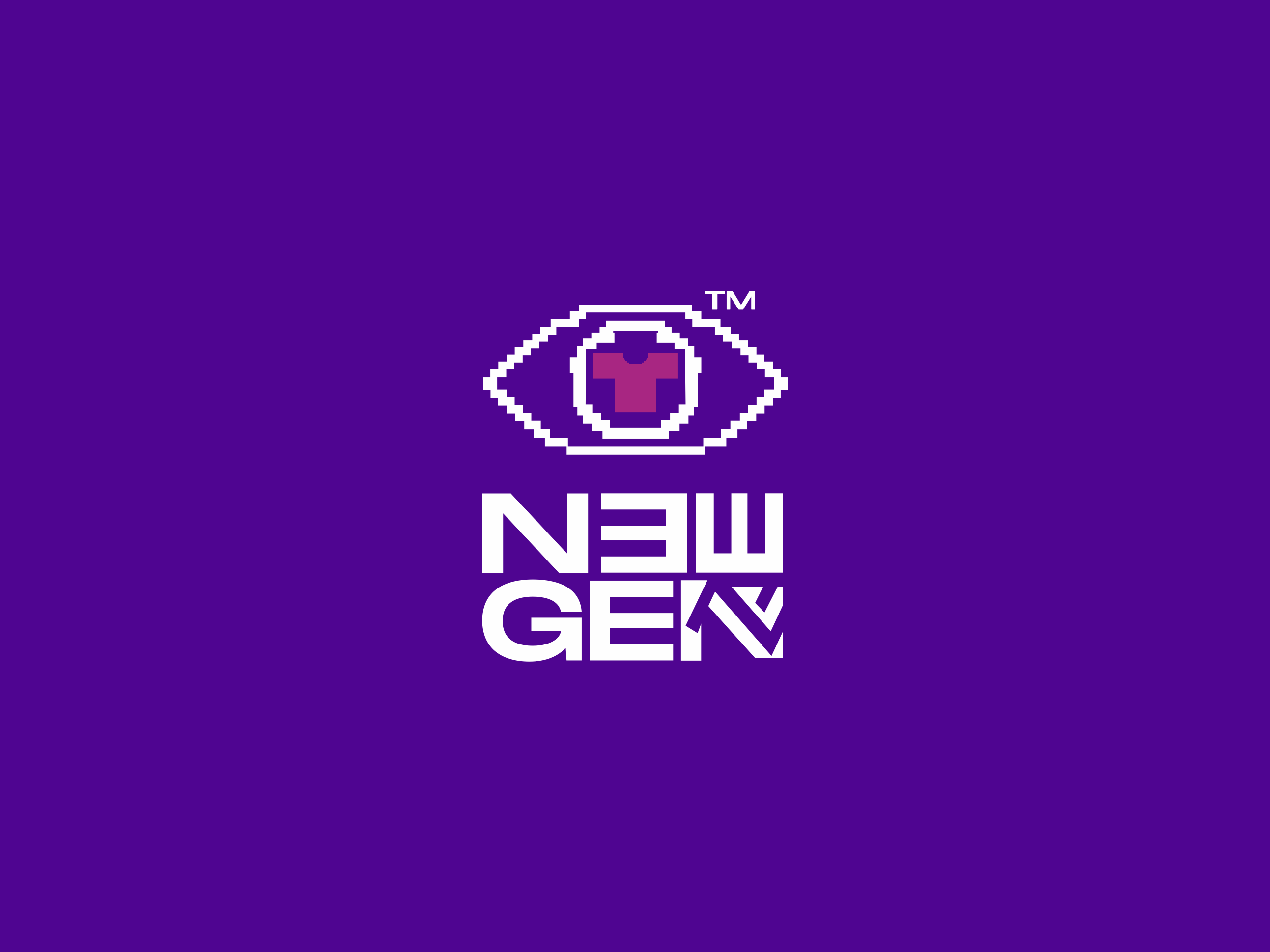
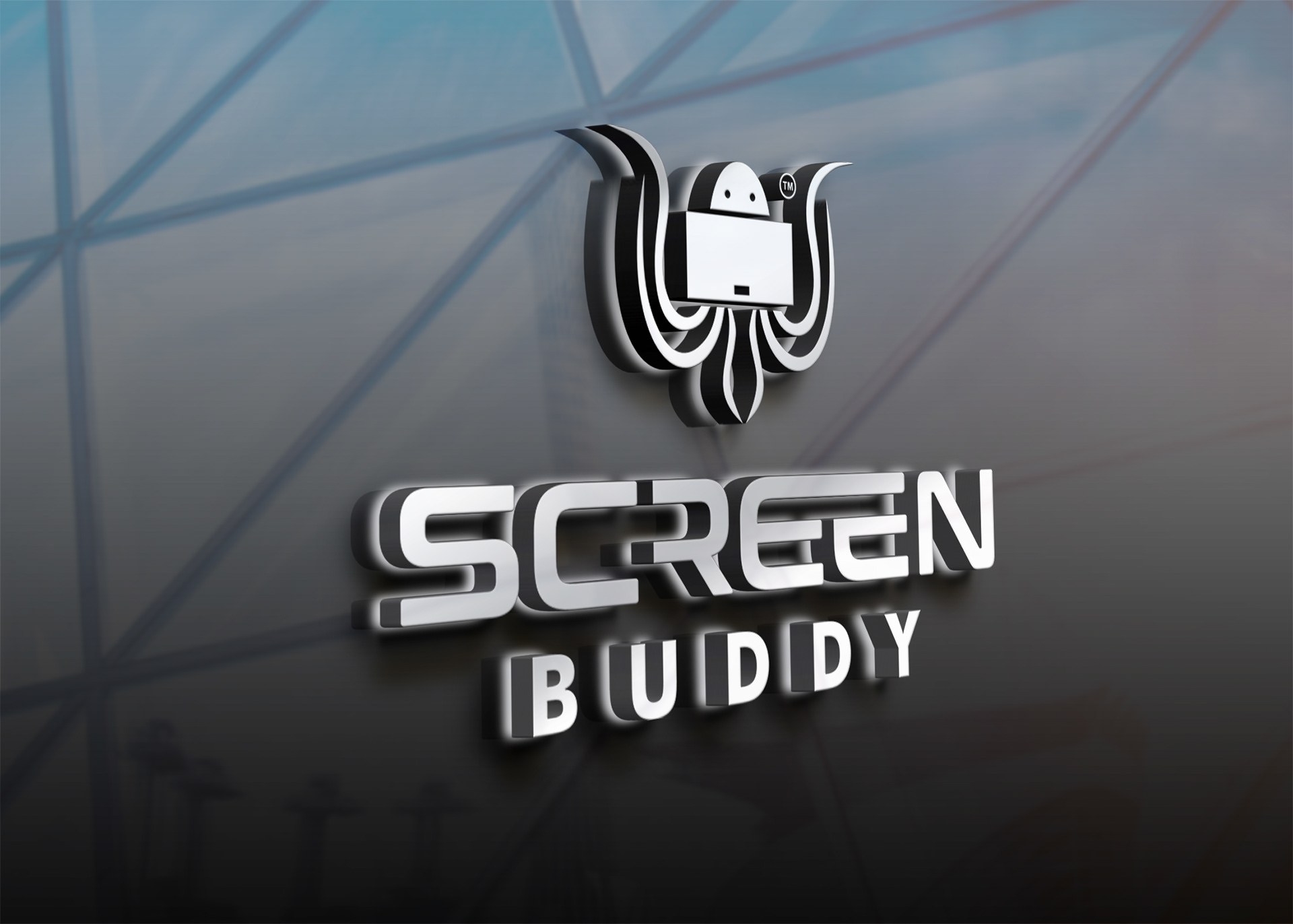

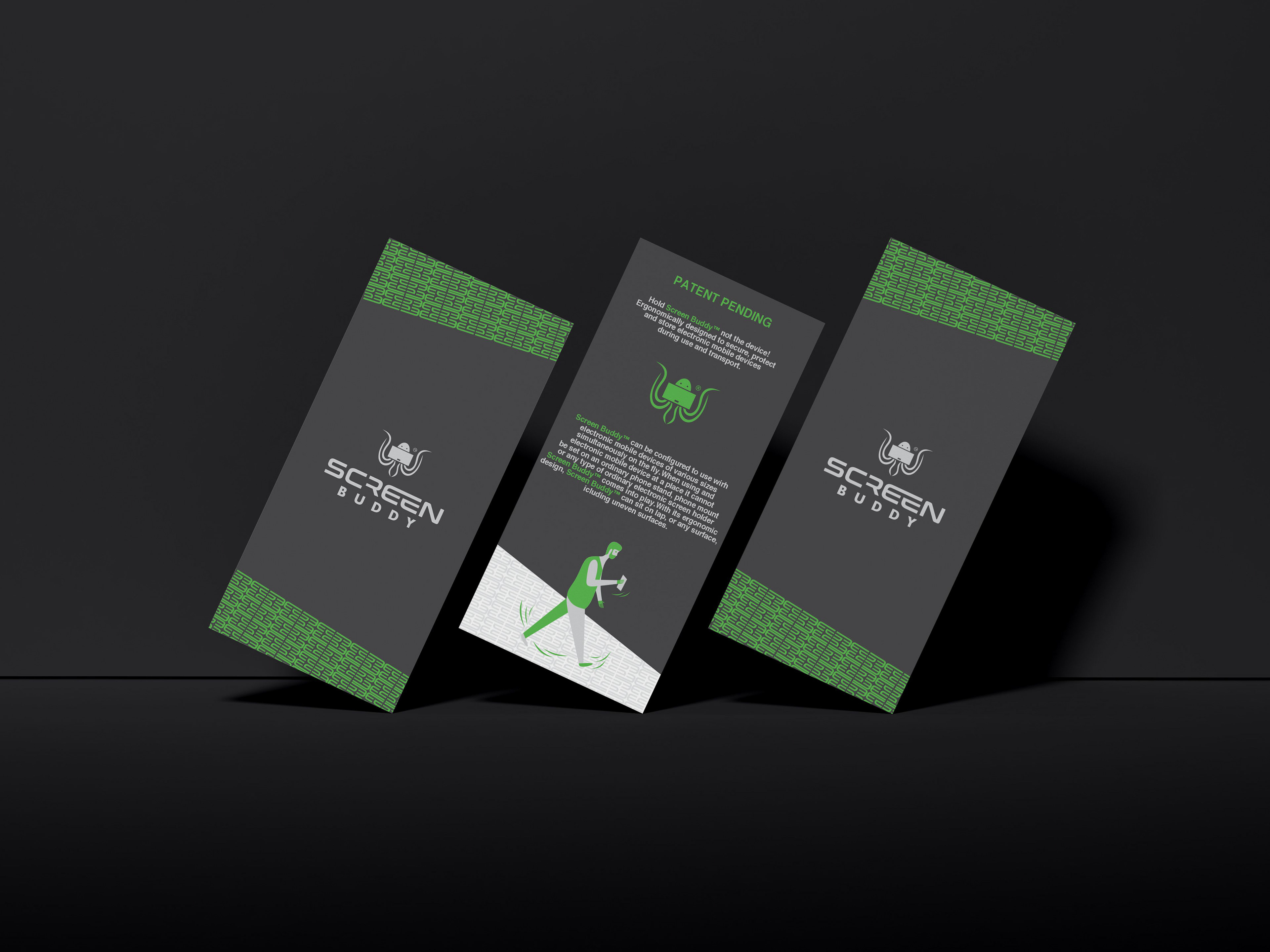
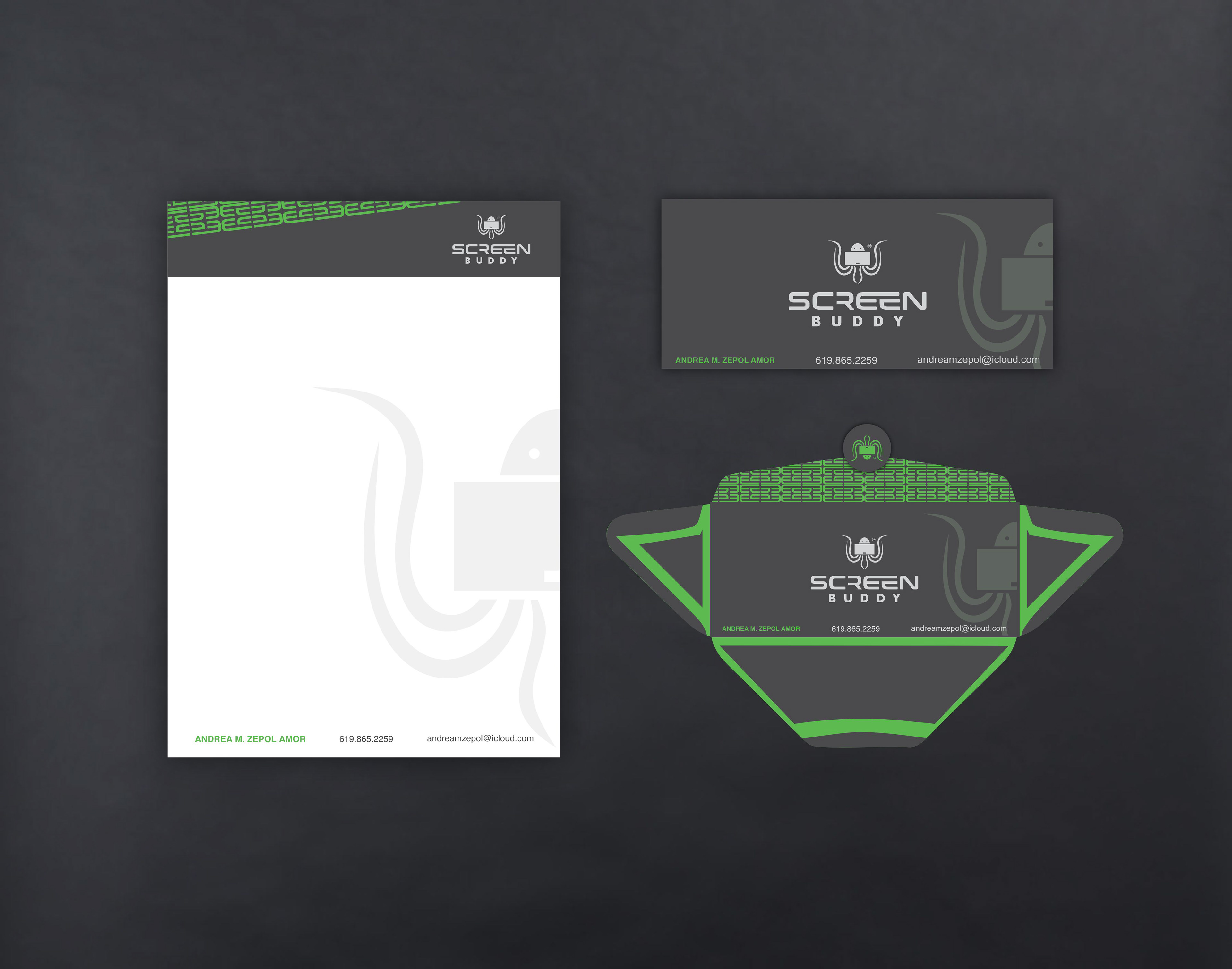
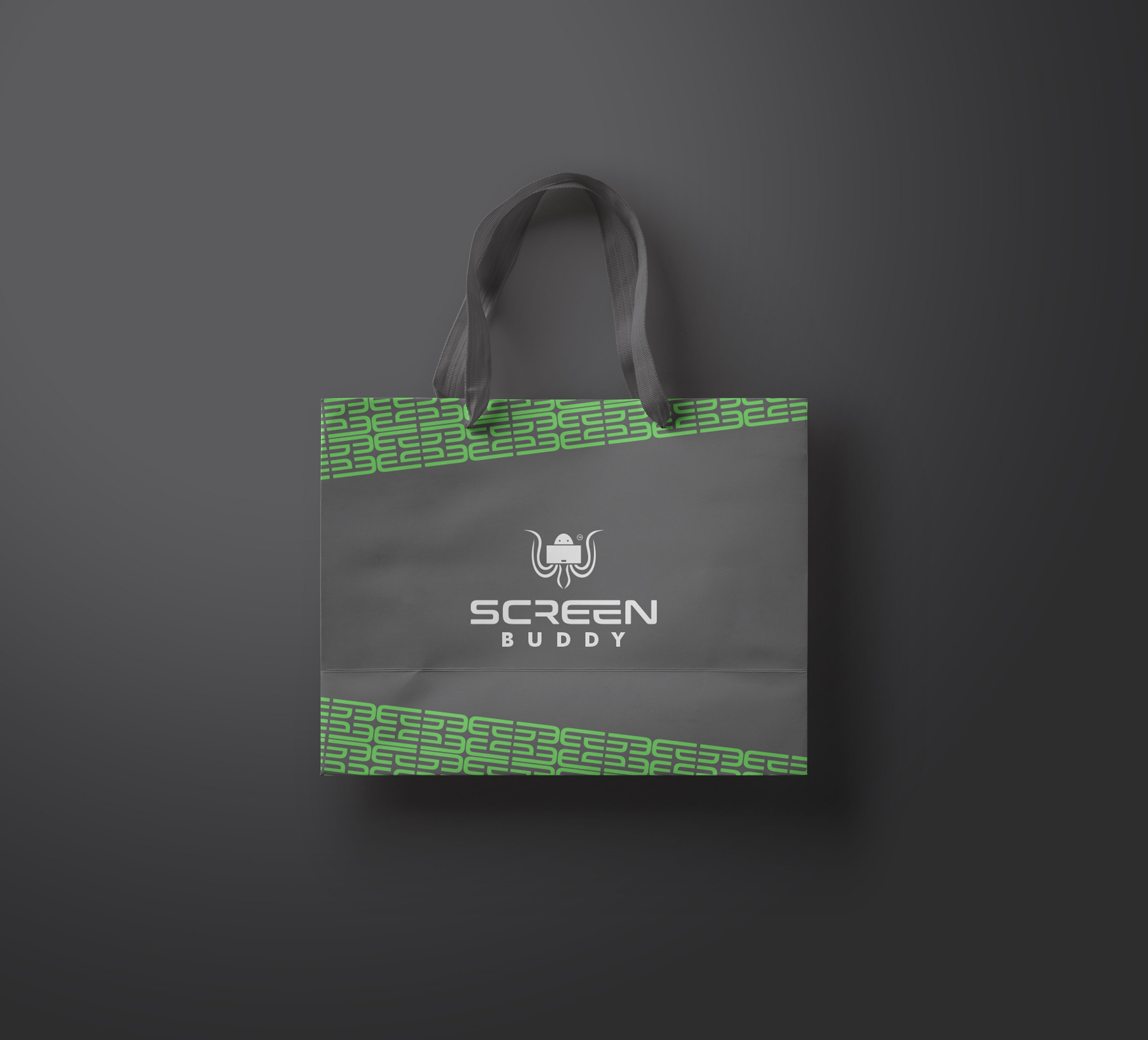
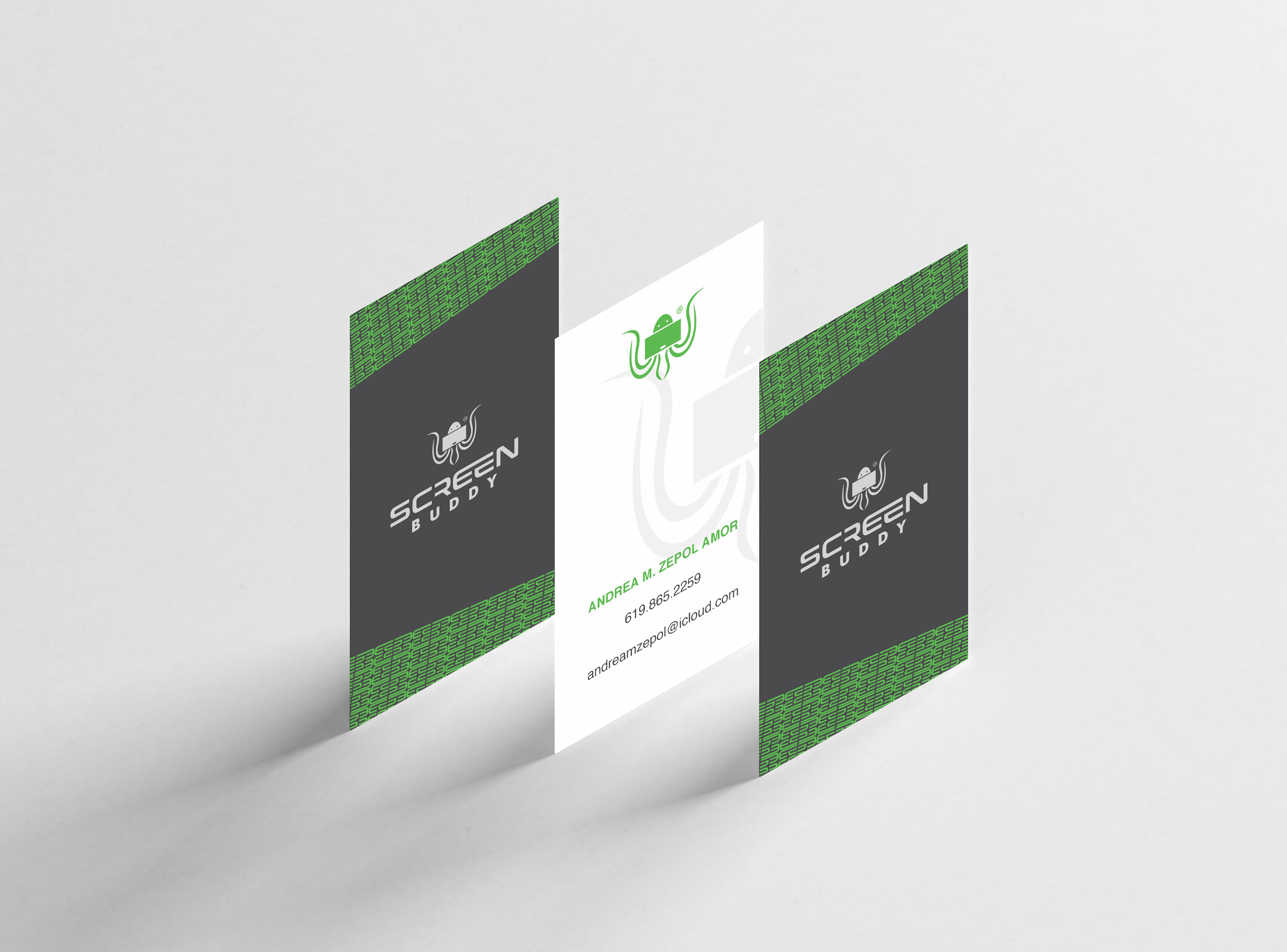
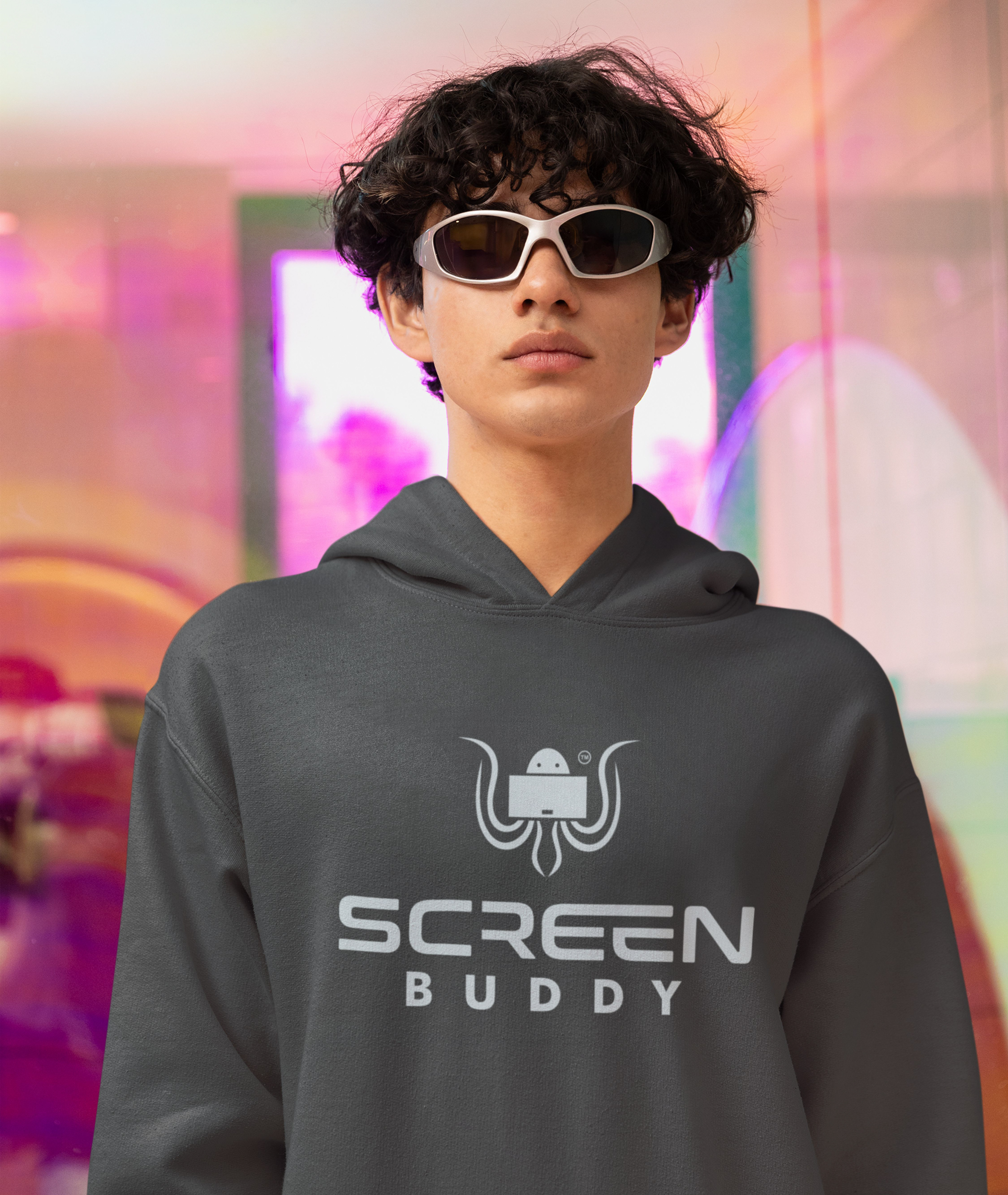
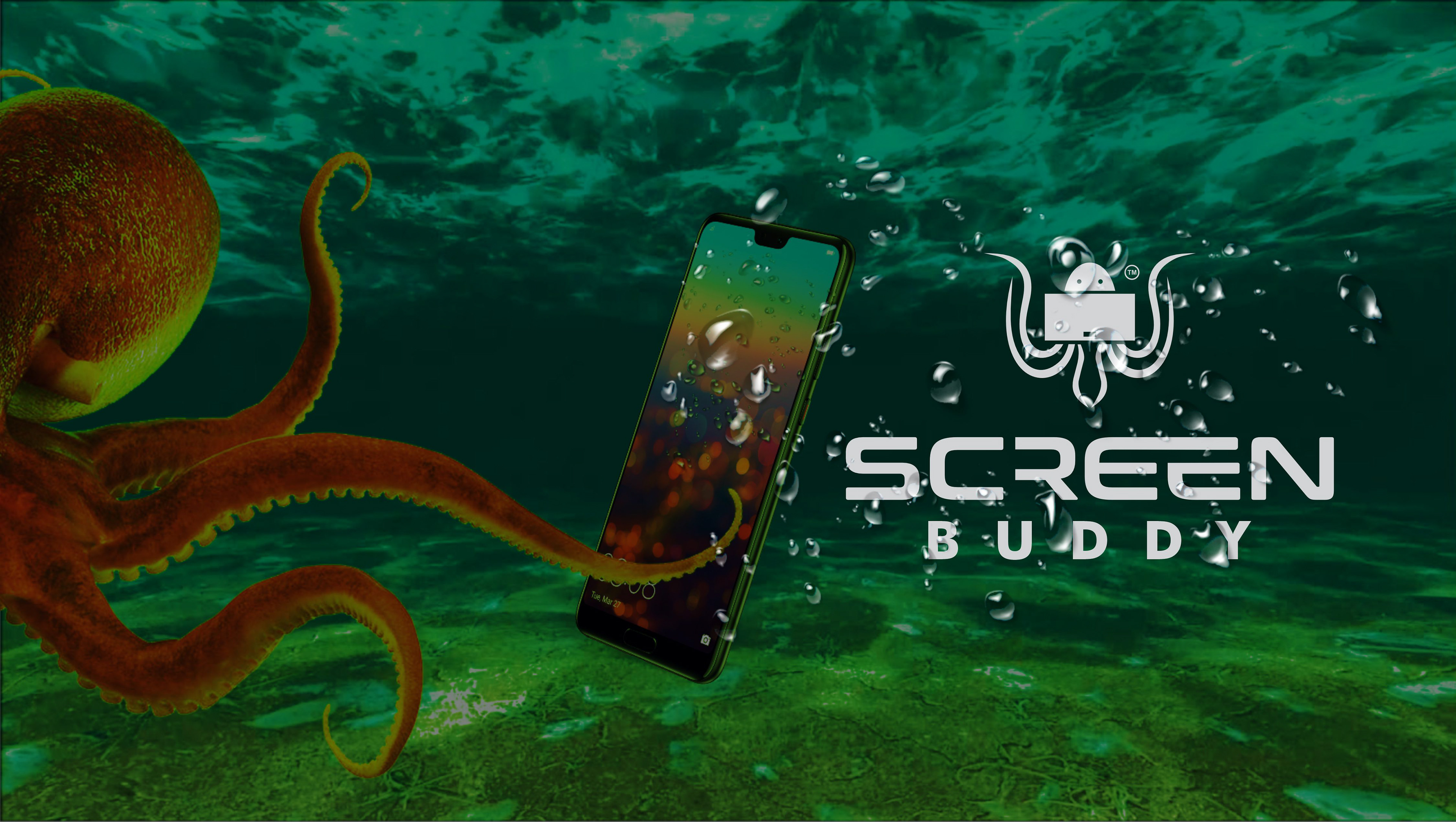
This branding was developed for a U.S.-based company specializing in the production of protective accessories for electronic devices, designed to enhance both protection and everyday usability. The products are created to make device usage more comfortable in various situations whether lying down, walking, or using devices hands-free.
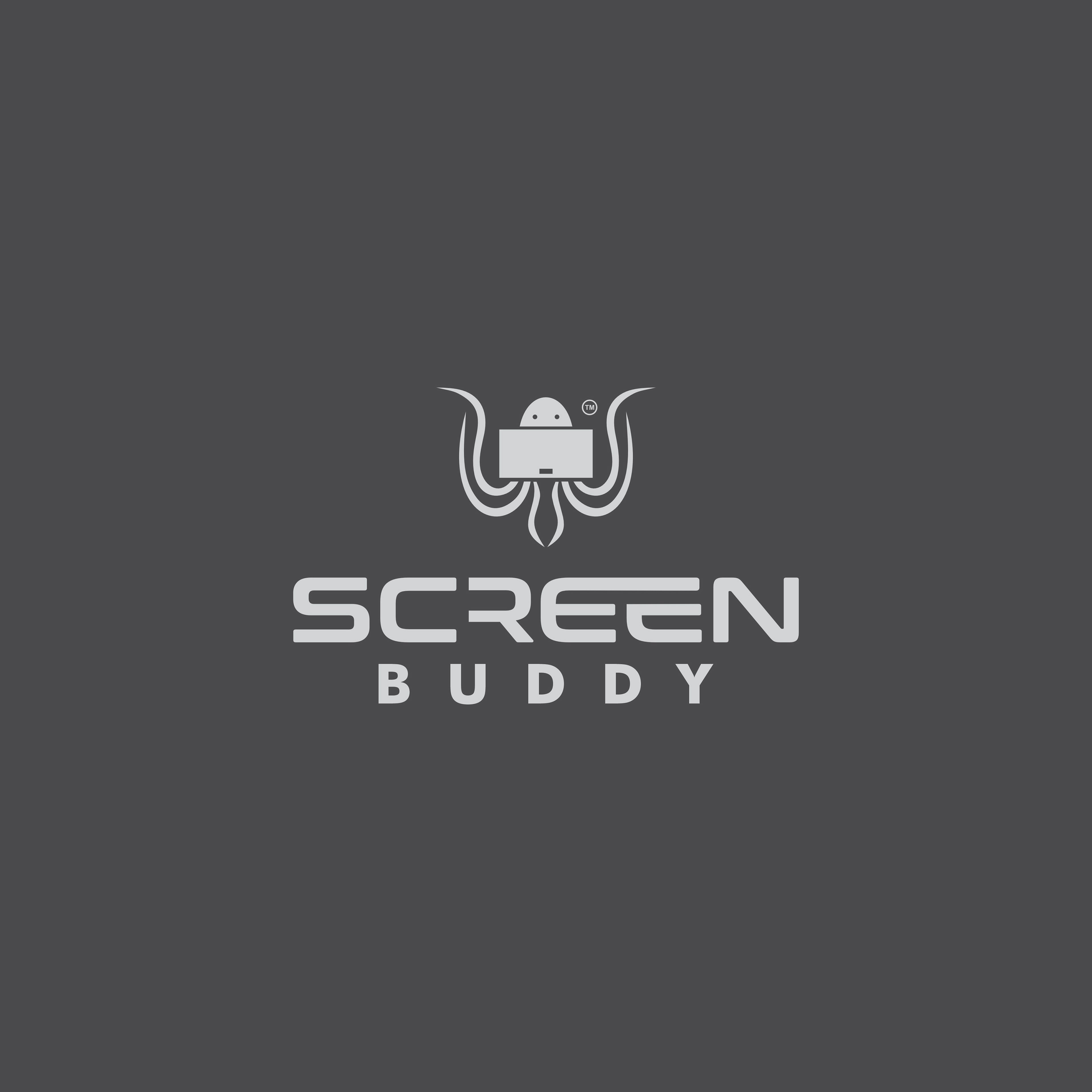
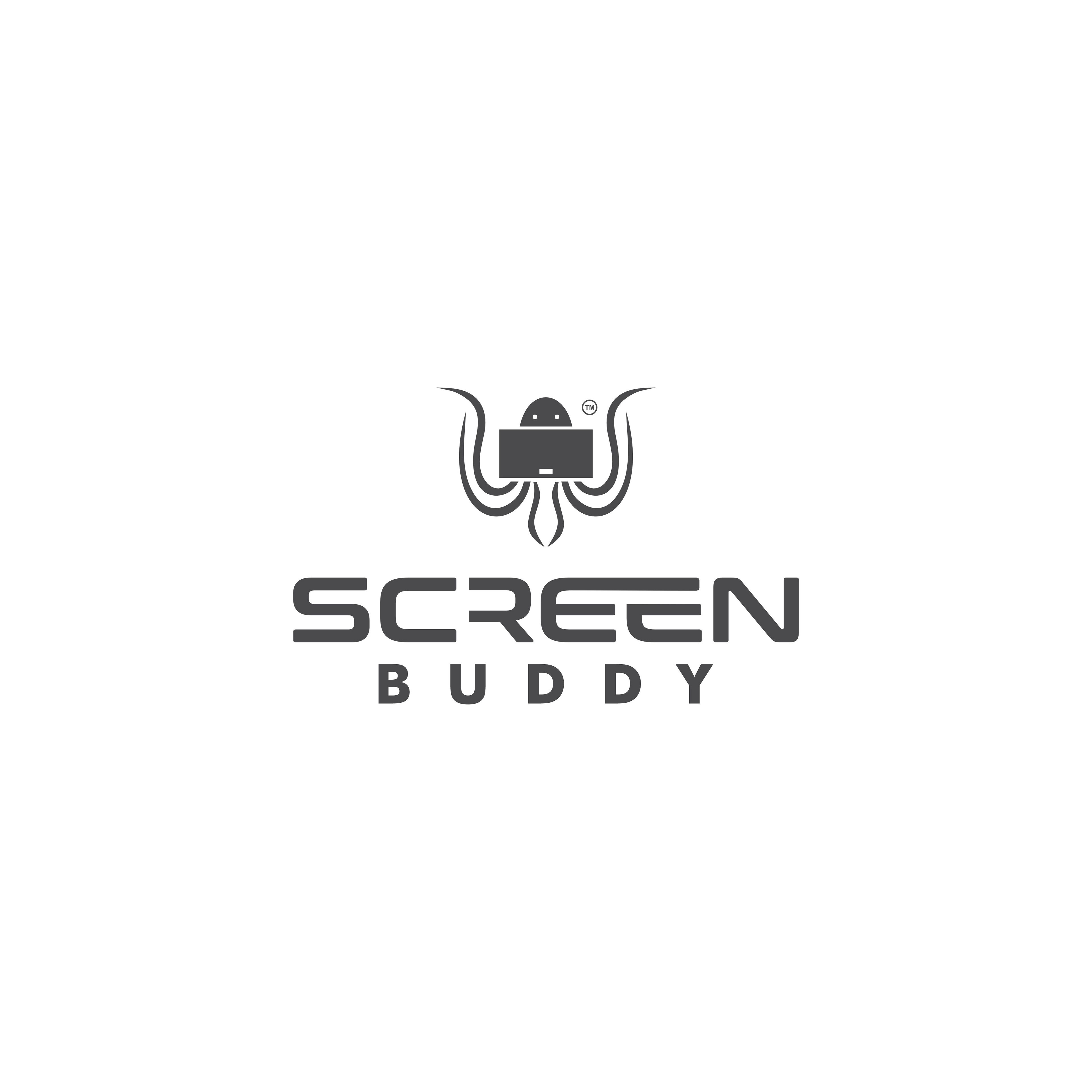
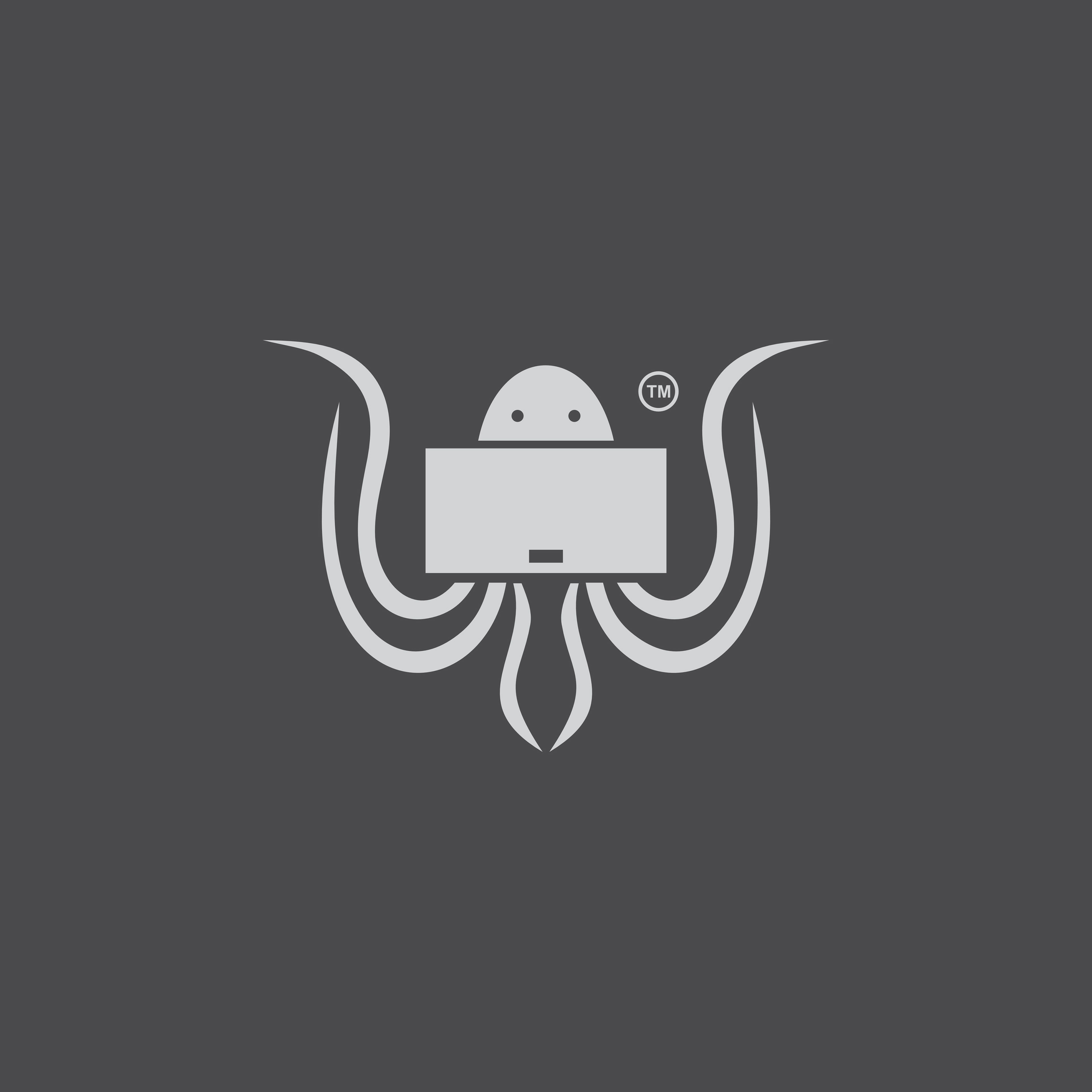
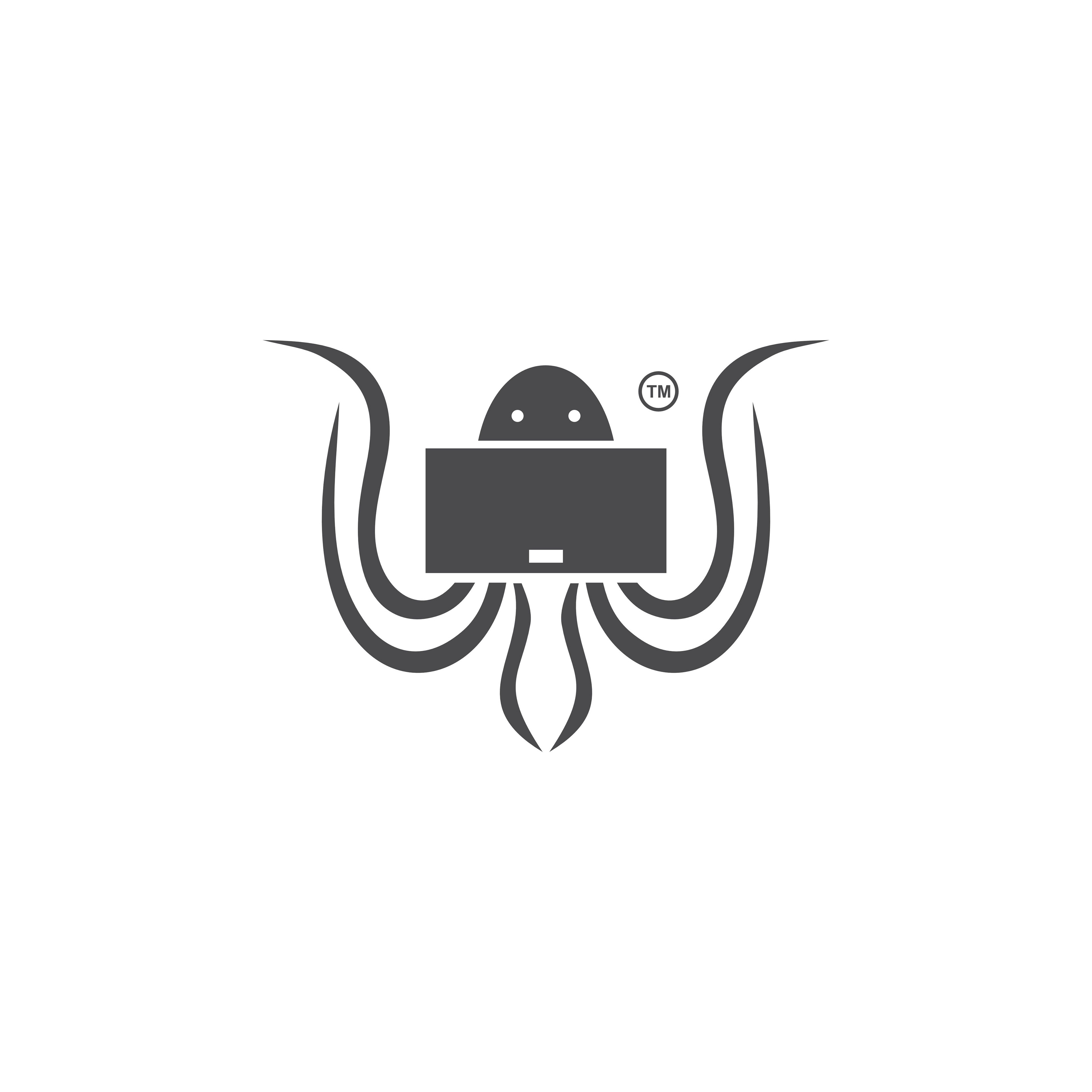
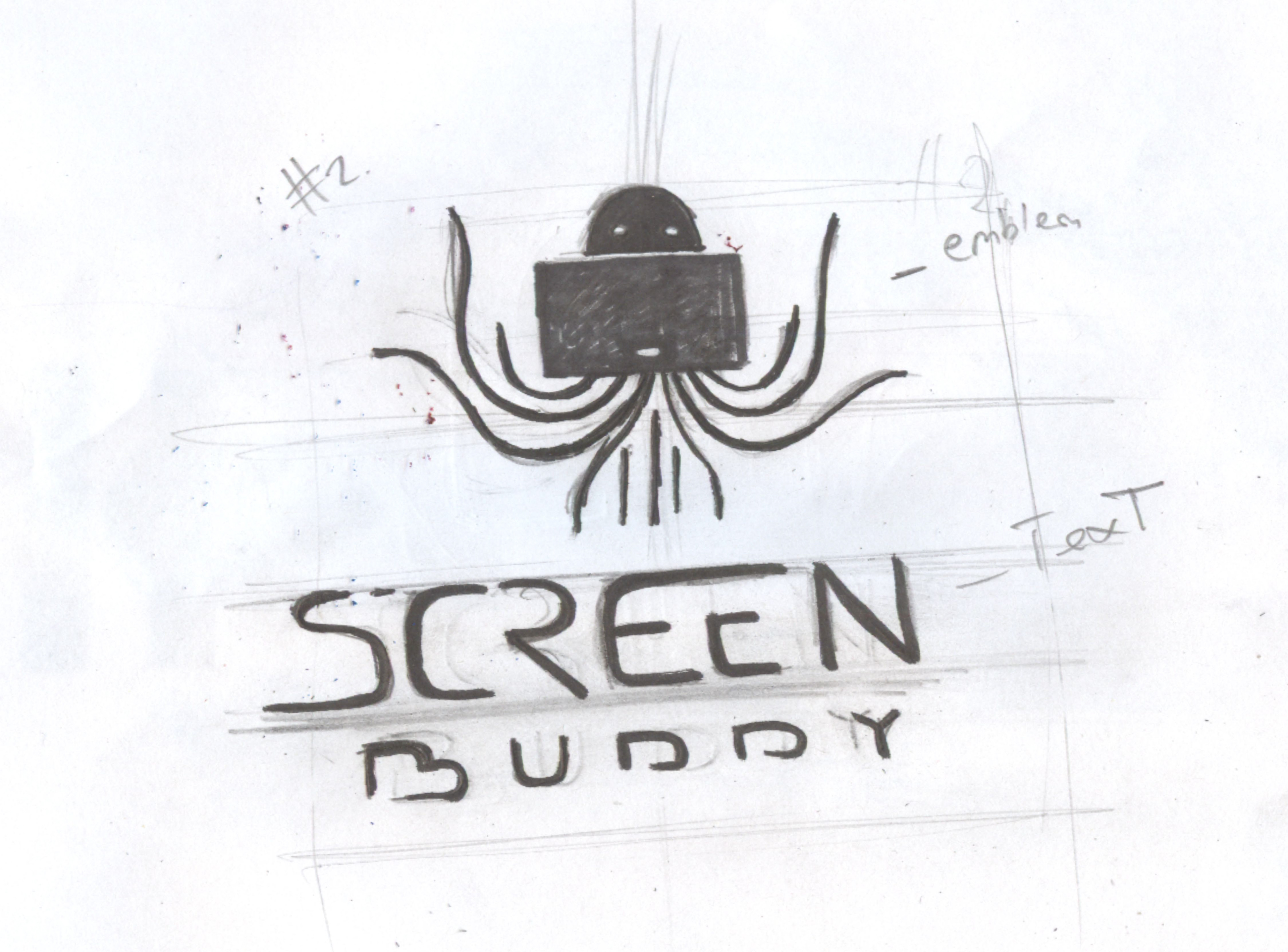
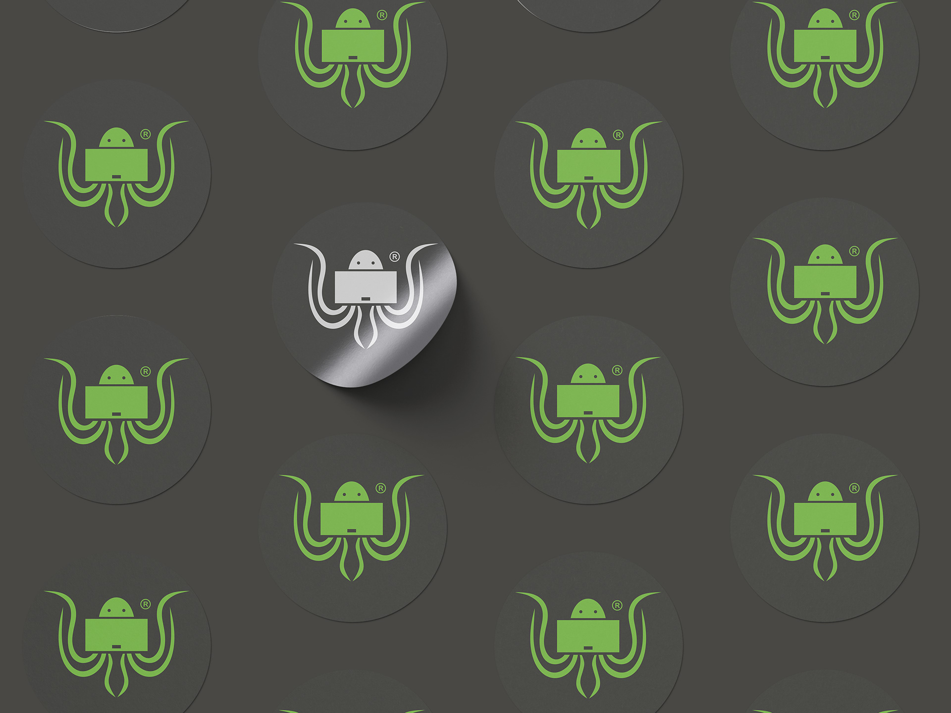
The brand concept is built around the octopus symbol, chosen for its strong association with flexibility, adaptability, and multifunctionality. Just like an octopus can effortlessly operate in different environments, the brand’s products are designed to be used seamlessly across multiple scenarios and contexts. This metaphor reinforces the idea of freedom, movement, and intelligent design.
At the center of the octopus symbol, a tablet device is integrated, clearly emphasizing the brand’s focus on modern electronic technology and digital lifestyles. This visual connection strengthens the brand’s relevance within the tech accessories market and makes its purpose immediately recognizable.
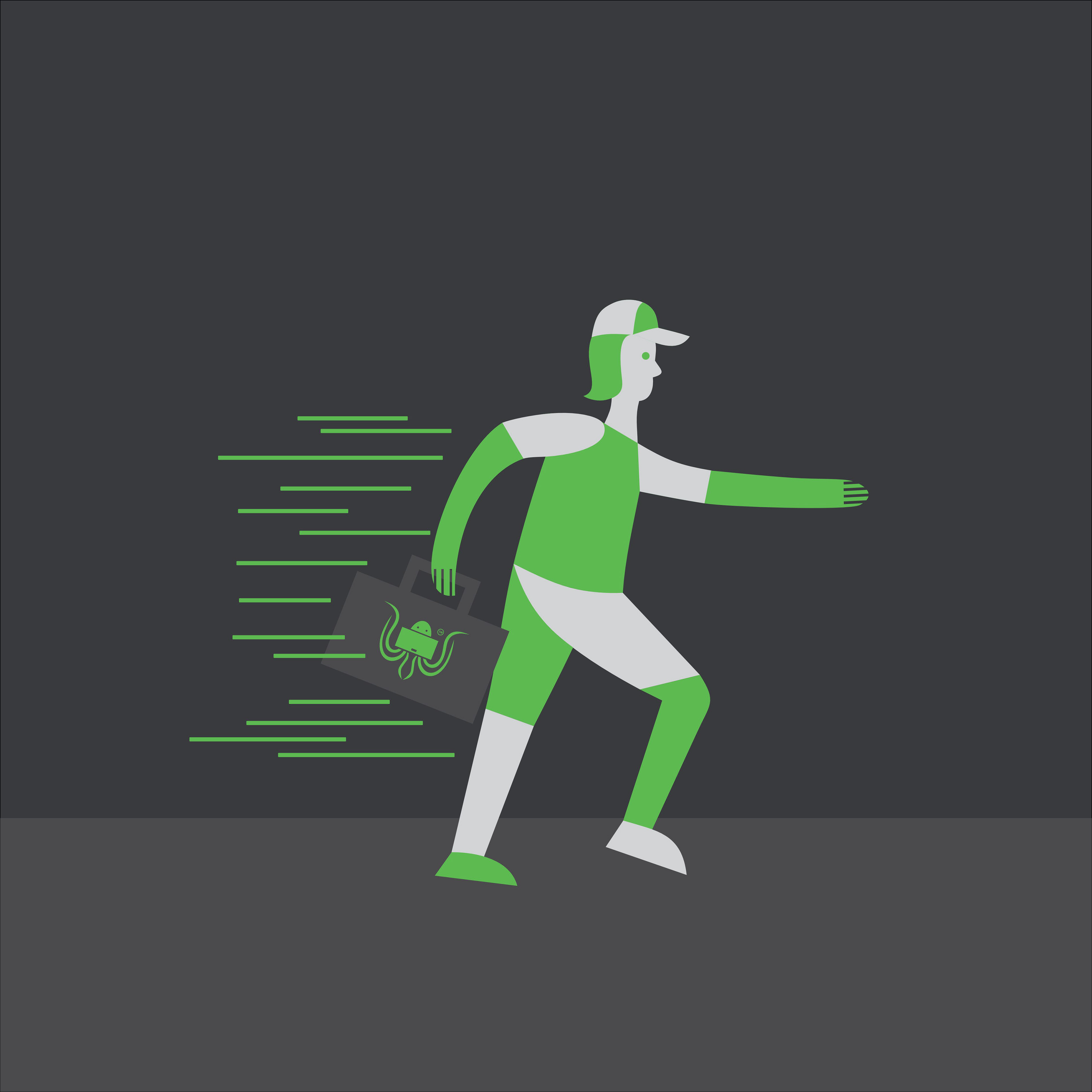
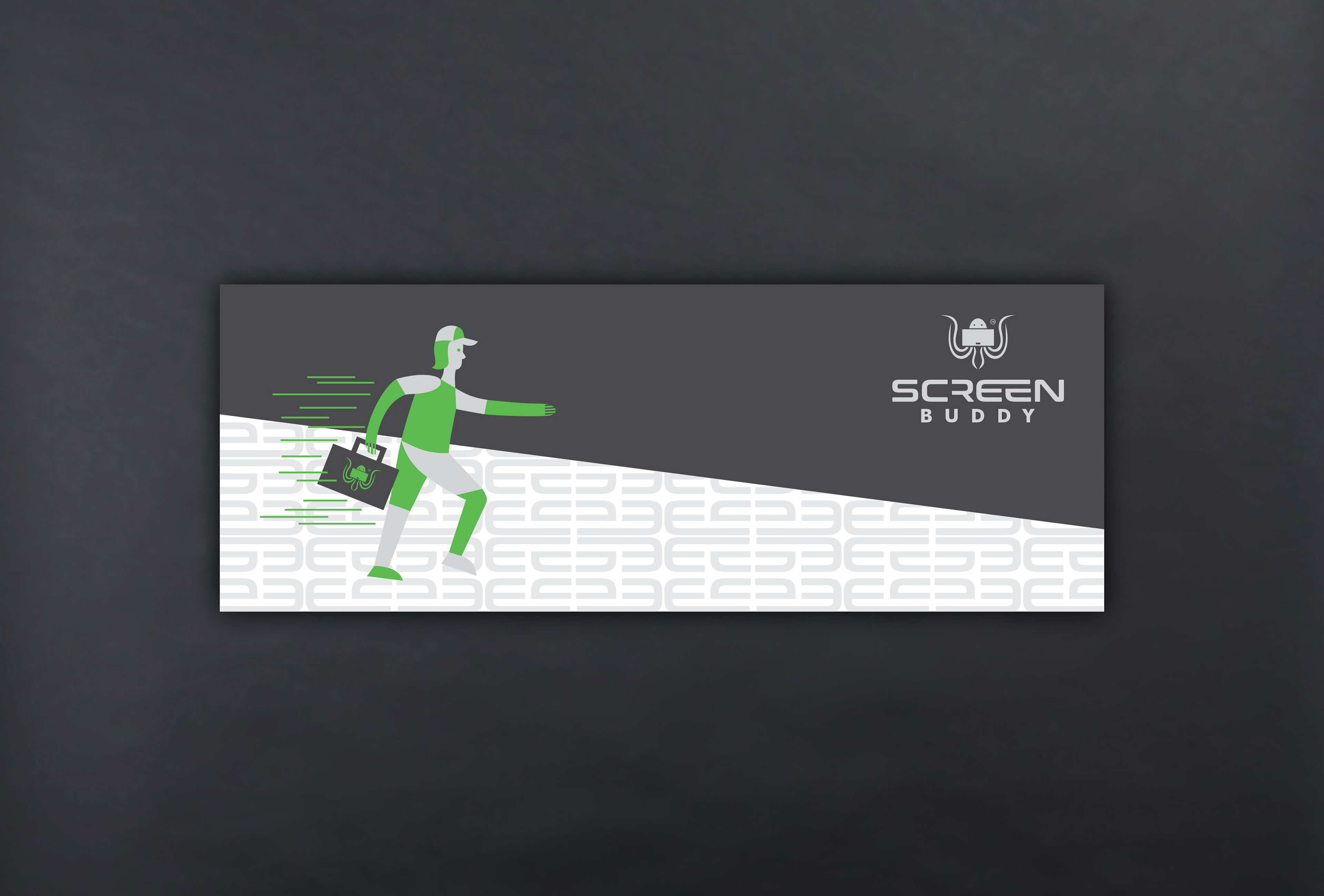
The typography is custom-designed in a futuristic style, highlighting the brand’s technological orientation and innovation-driven mindset. Clean lines, balanced proportions, and modern letterforms contribute to a forward-looking visual identity that resonates strongly with a young, tech-savvy target audience.
The entire branding system follows a minimalist design approach, ensuring clarity, versatility, and scalability across digital and physical applications. Despite its simplicity, the identity is highly distinctive and memorable, creating a strong visual presence that stands out in a competitive market while maintaining a clean, modern aesthetic.