


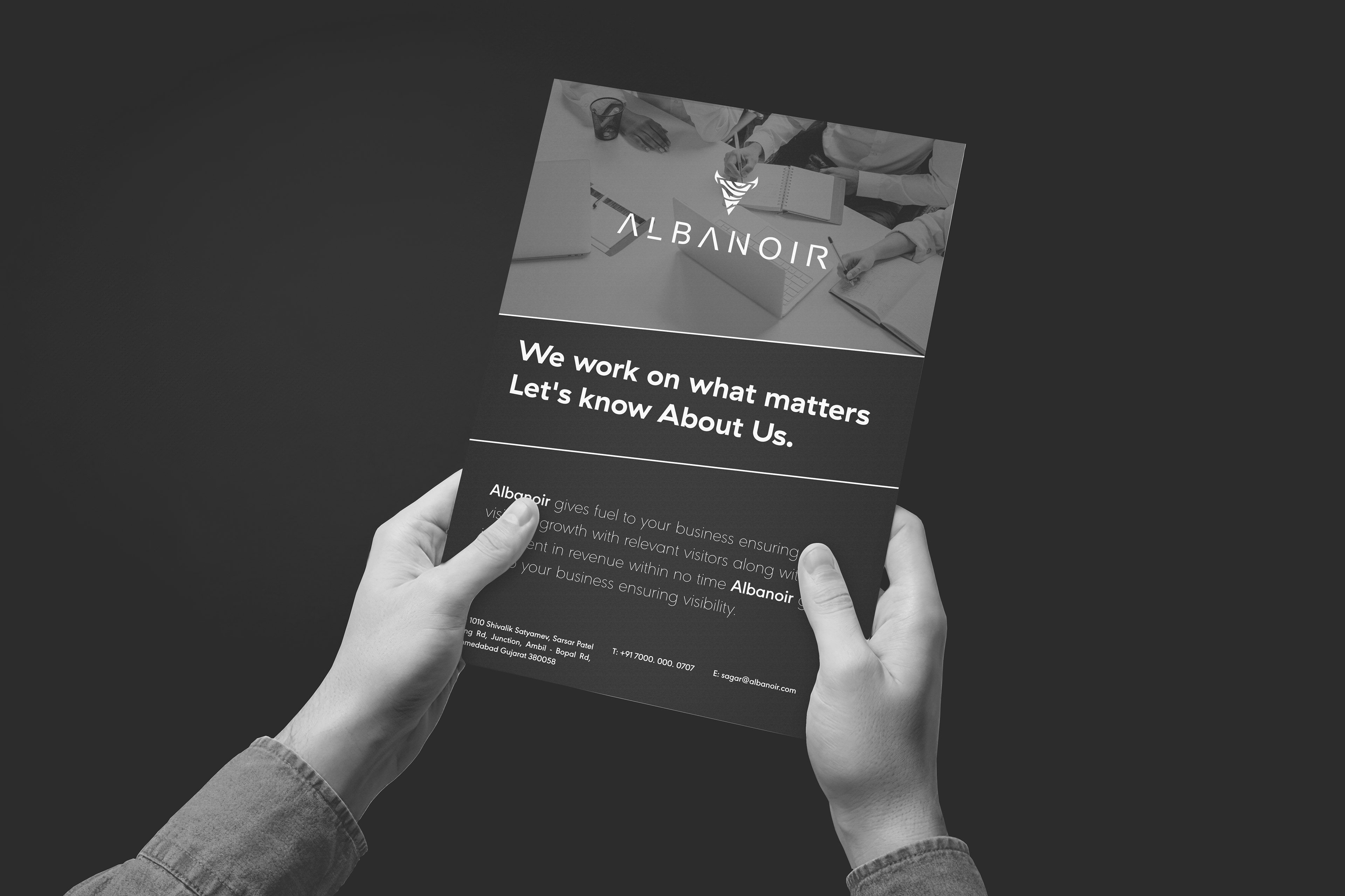
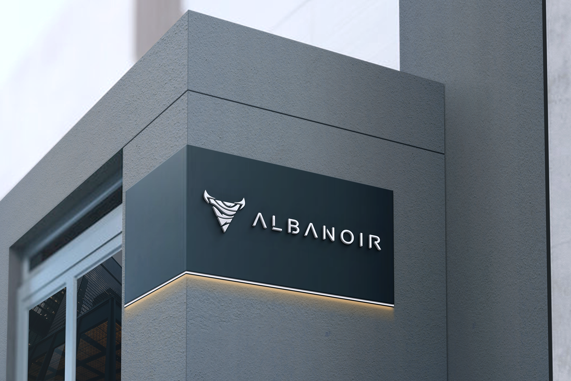
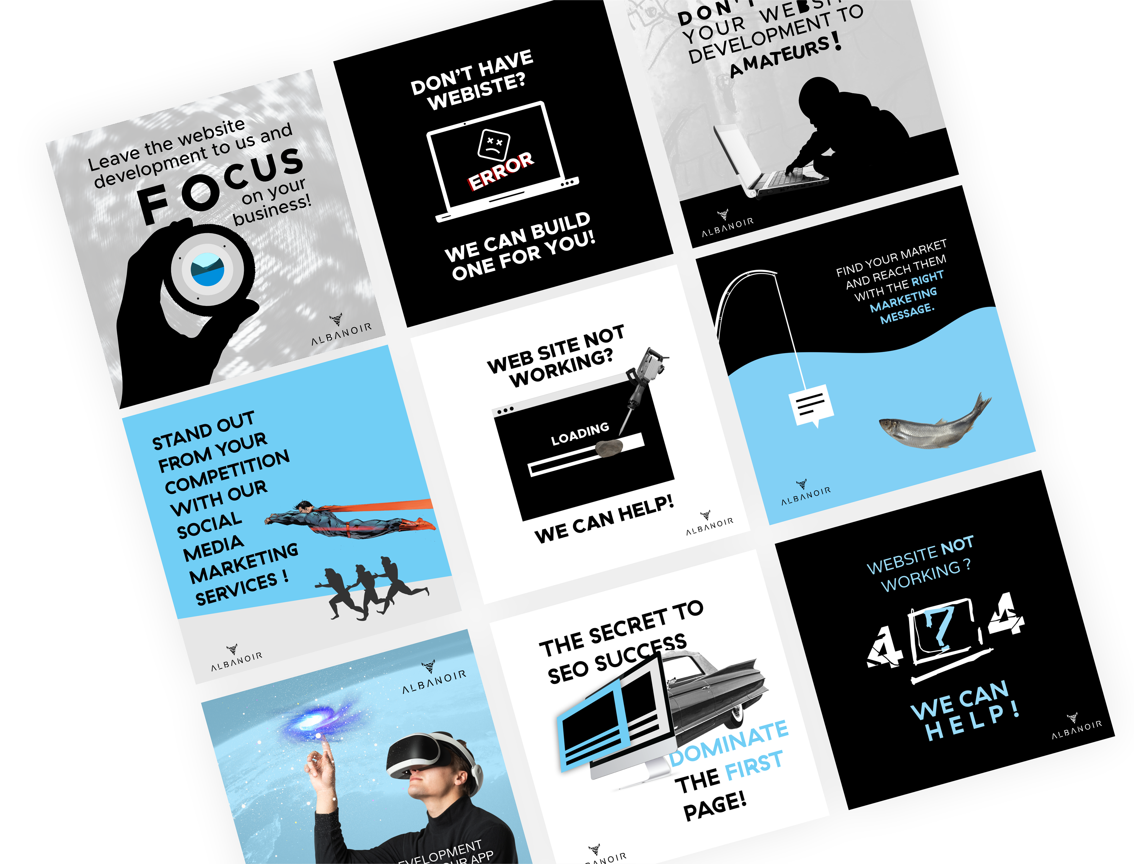
ALBANOIR is a marketing-focused brand built on movement, contrast, and clarity of message. The brand identity was developed as a complete visual ecosystem, including logo design, Instagram post design, and full brand character development.
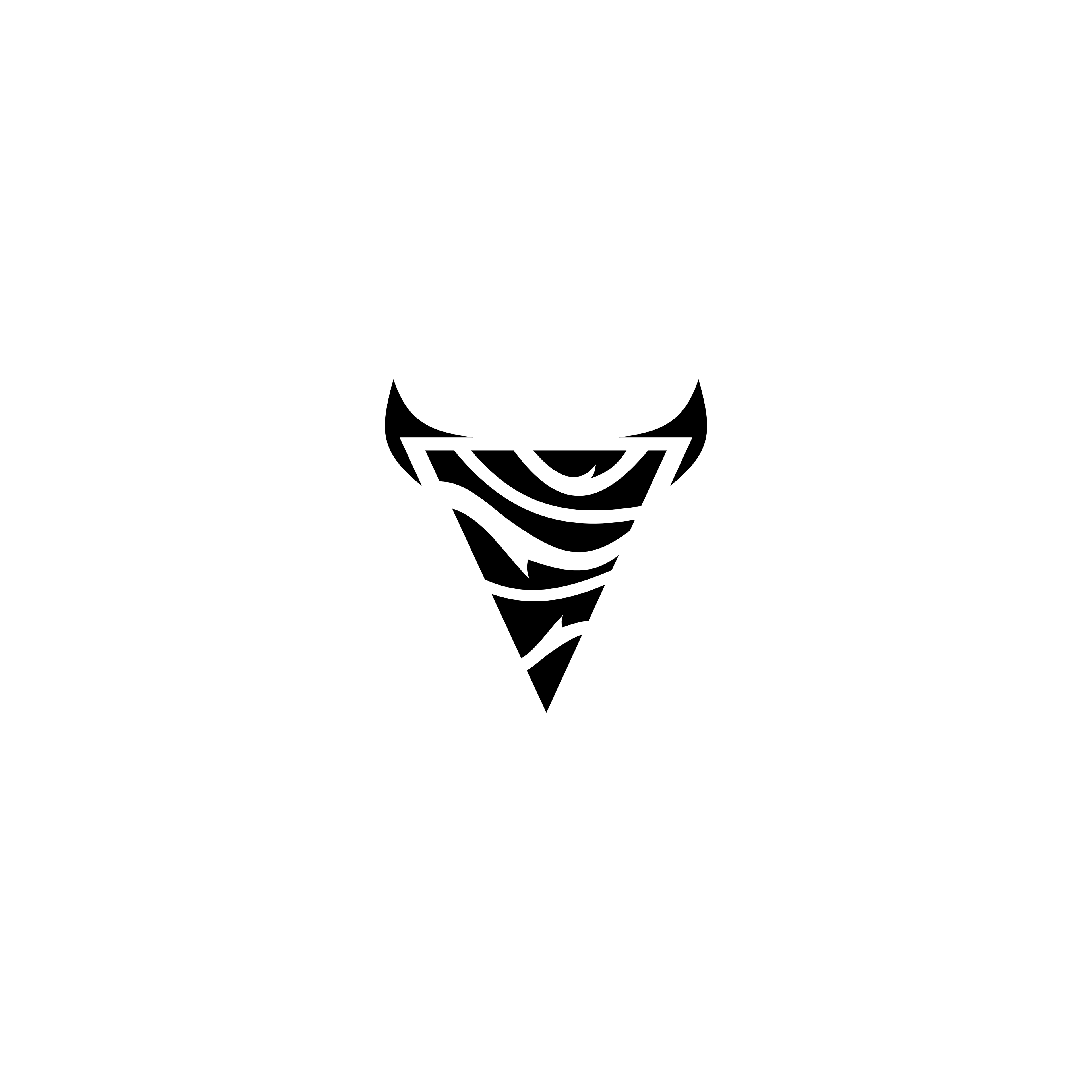
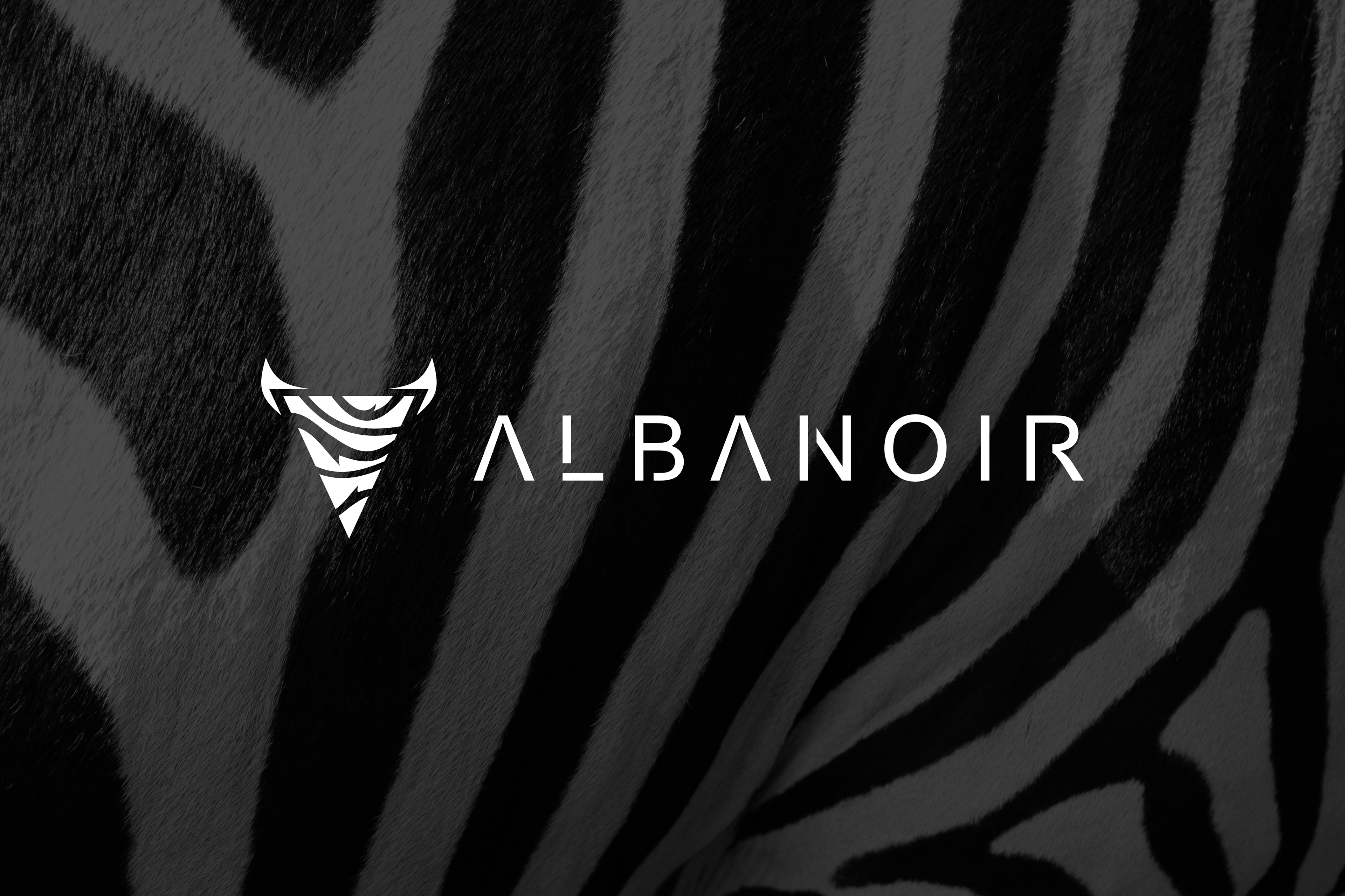
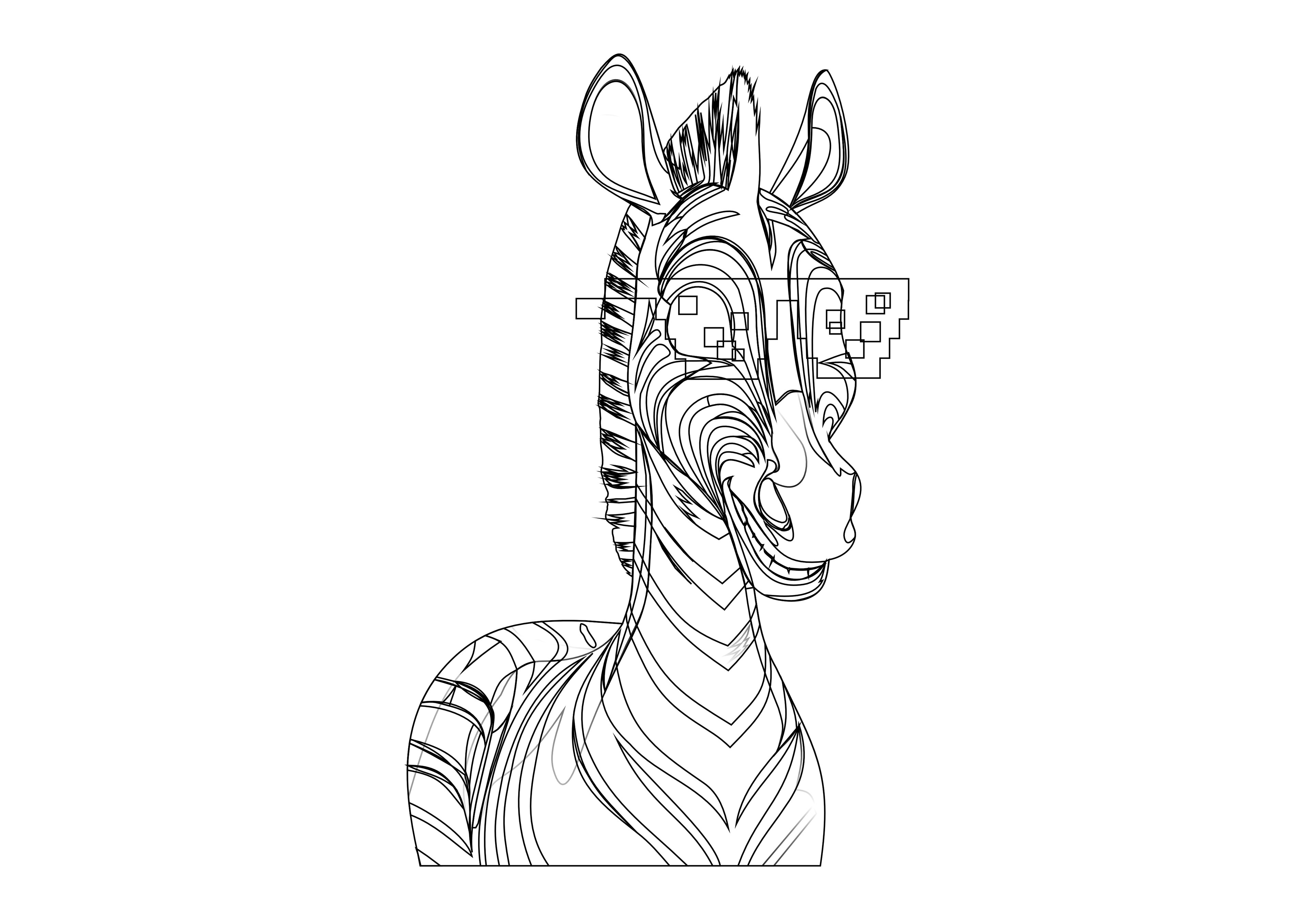
The logo was created from scratch as a fully vector-based mark, inspired by the zebra concept. The zebra symbolizes duality, balance, and differentiation core values in a competitive marketing environment. Clean, sharp graphic forms ensure strong readability and high impact across both digital and print platforms.
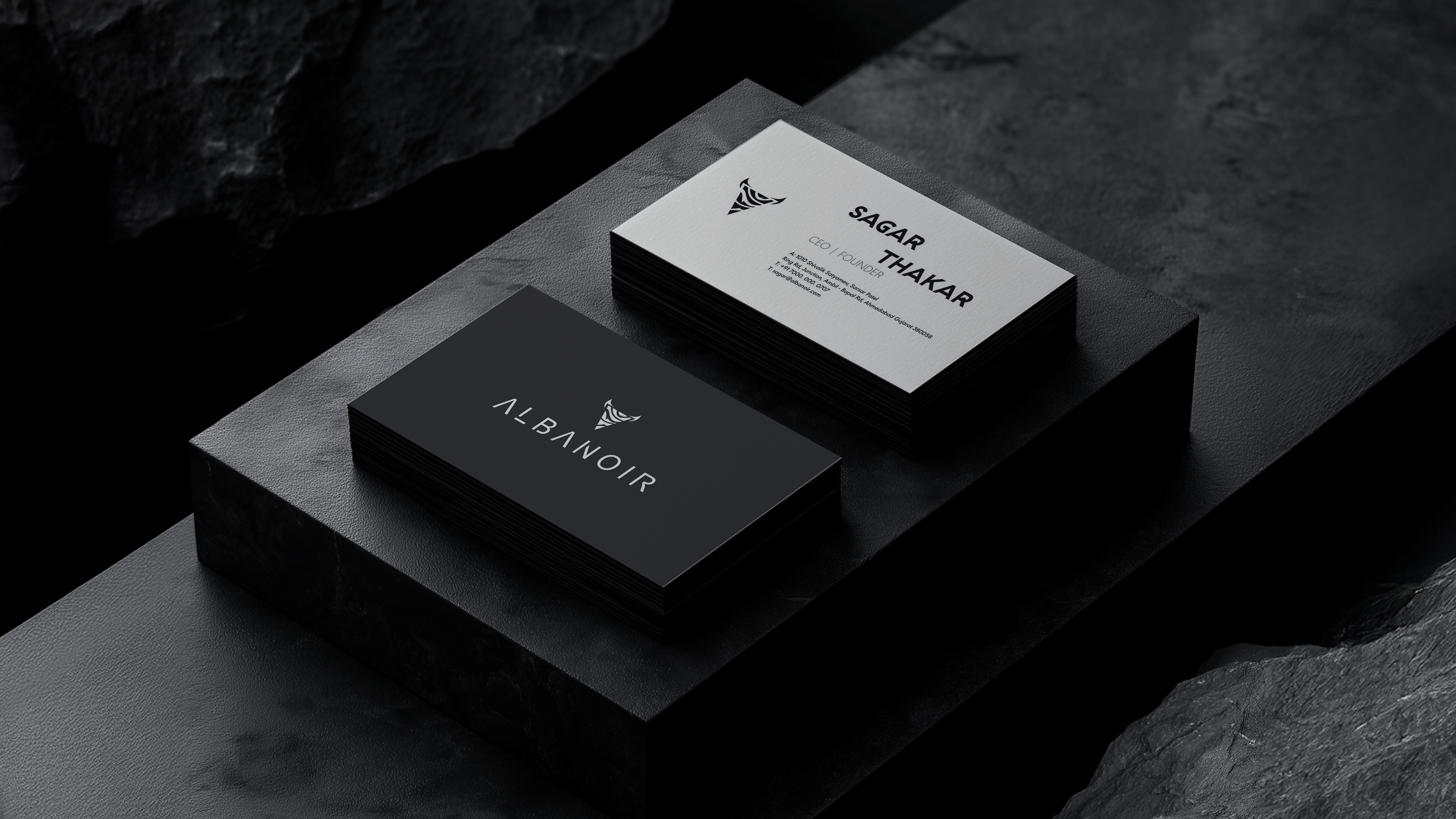
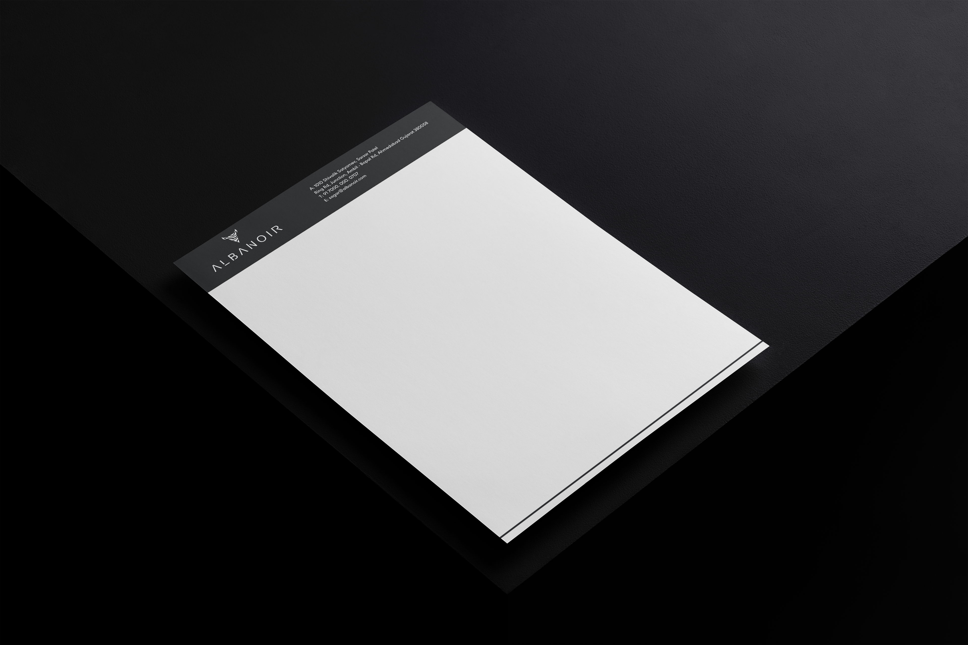
The typeface was custom-designed from zero, exclusively for the brand. It is based on a geometric structure with carefully balanced spacing and sharp terminals, conveying a modern, confident, and professional tone. The typography is visually aligned with the logo’s graphic language, reinforcing a cohesive and recognizable brand identity.
The color palette is built around black, white, and light blue contrasts. Black represents strength, authority, and a premium feel; white conveys clarity and simplicity; while light blue introduces a technological, digital, and trustworthy accent. Together, these colors create a dynamic yet controlled visual energy.
ALBANOIR’s visual identity is designed not just to look strong, but to perform empowering brands to communicate clearly, stand out in the market, and turn attention into measurable results.