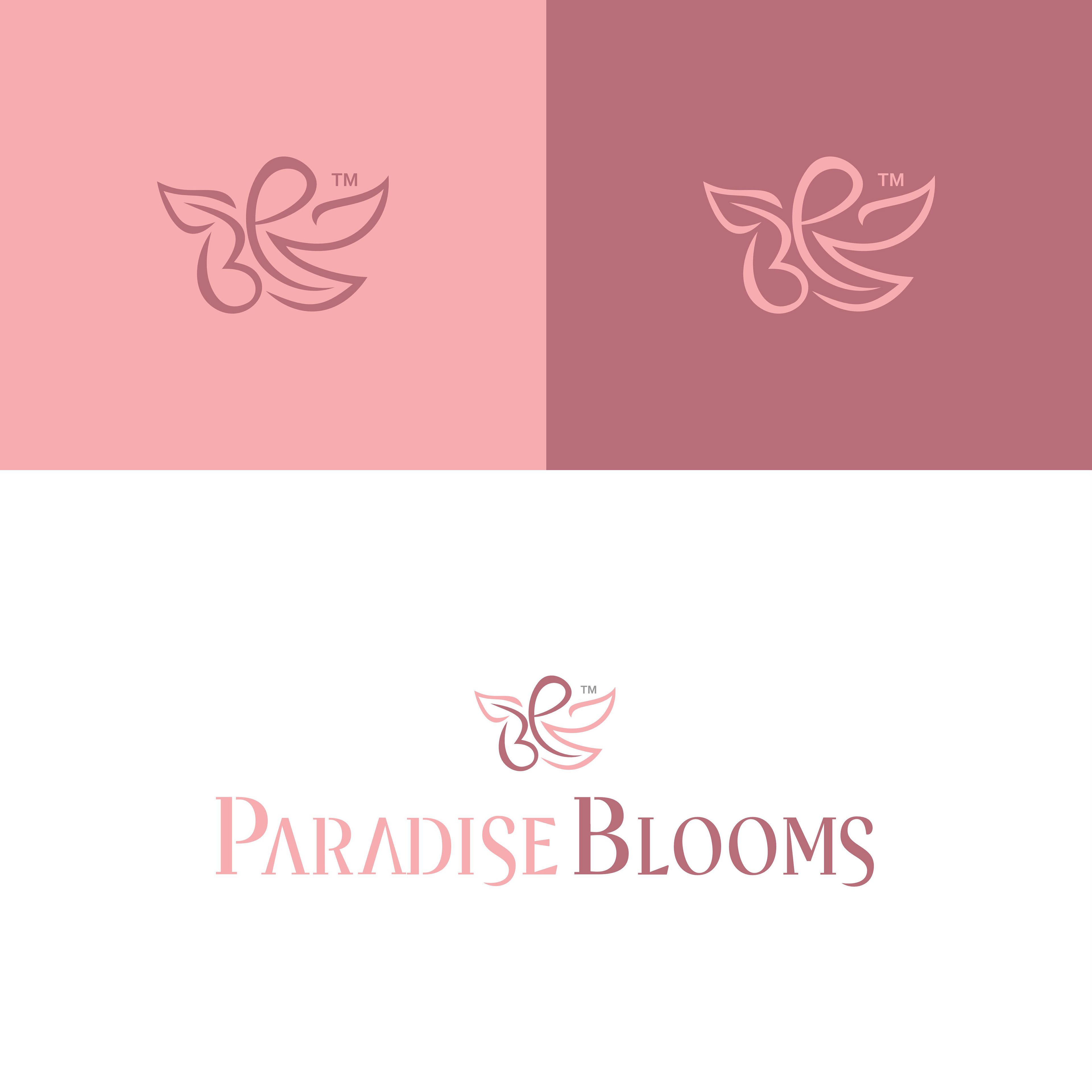
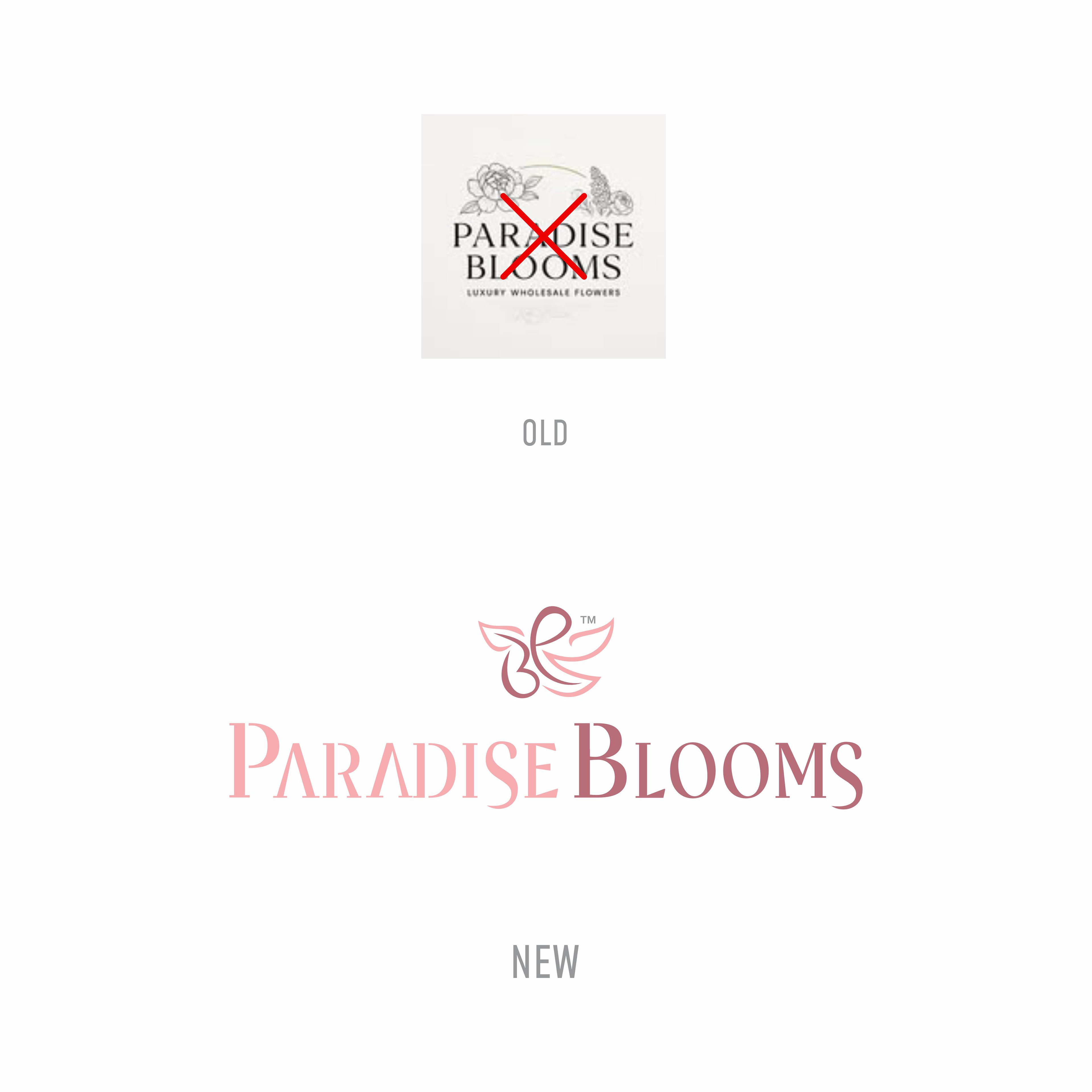
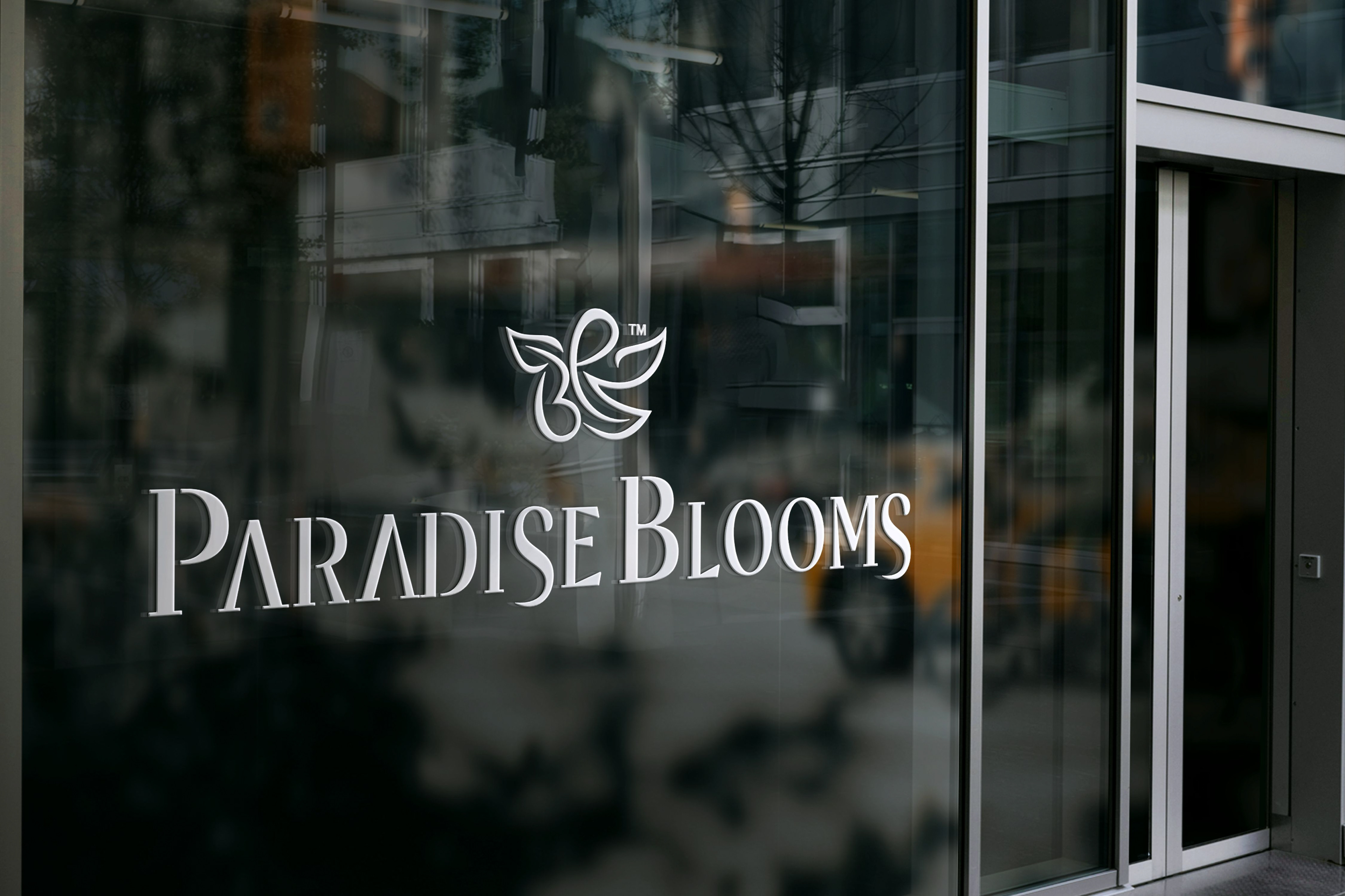
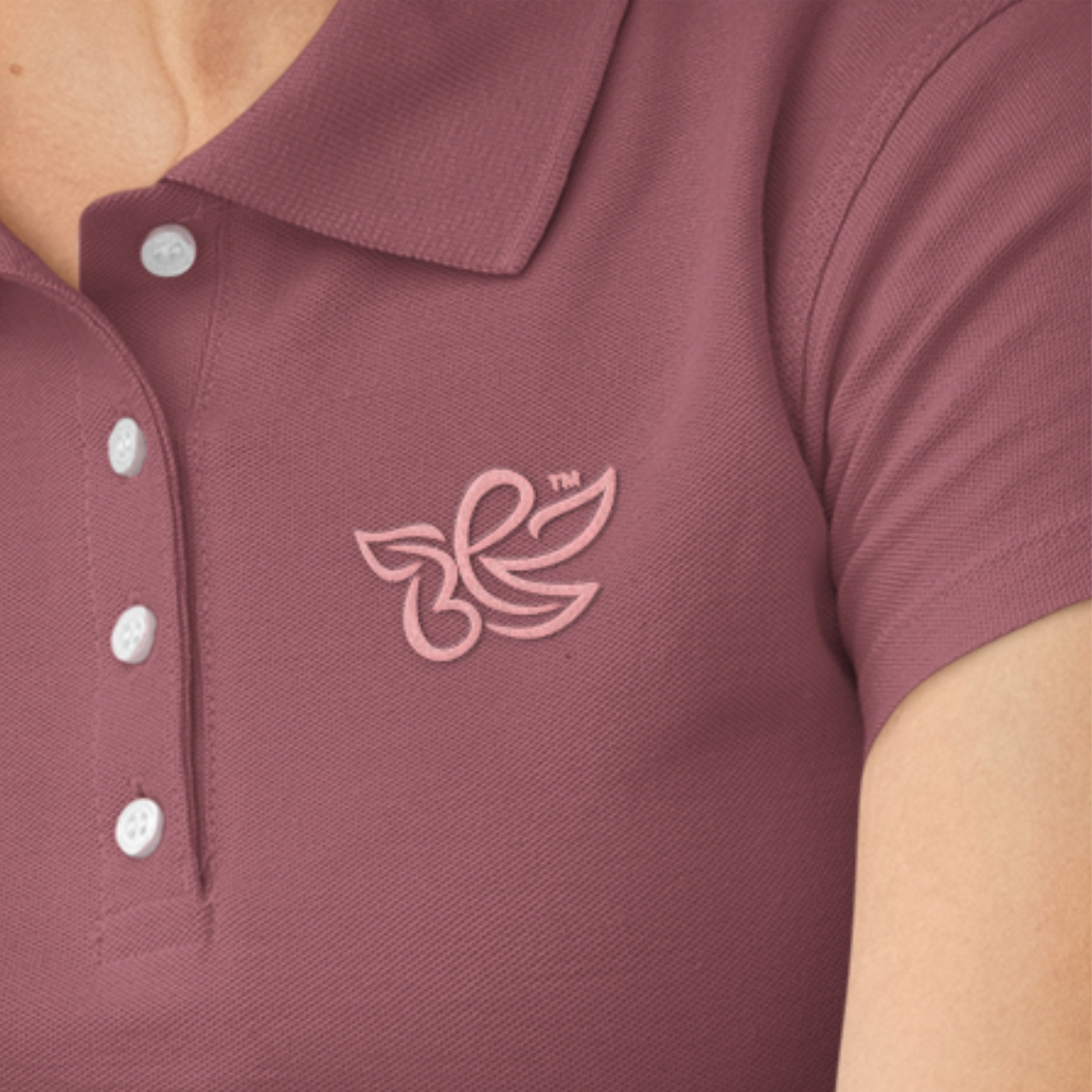
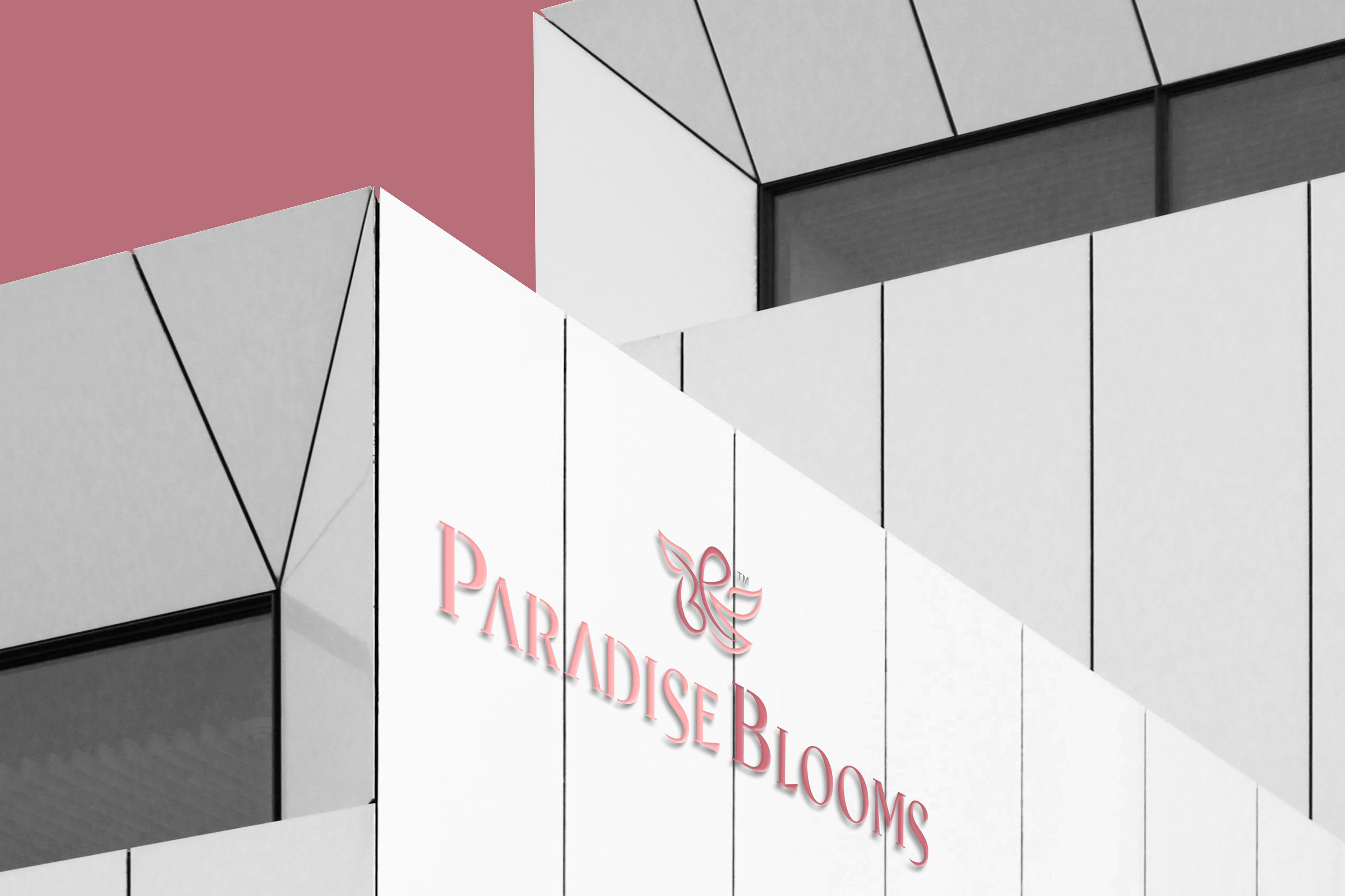
The idea behind the logo is rooted in the union of the letters P and B, which together form the shape of a flower while also subtly evoking the image of a butterfly. The butterfly naturally reinforces the concept of the flower, as butterflies are most often encountered in gardens rich with blossoms. In this way, the logo conveys the essence of the word “PARADISE” in a minimalistic manner.The overall design relies on smooth, flowing lines, which emphasize the brand’s luxury identity. At the same time, the lightness and delicacy of the composition ensure that the mark avoids feeling heavy or overwhelming.